Feeds:
Posts
Comments

Low bond yields have in the past been bad, not good, for equity returns.

See my earlier post on the Fed model “How predictive is the Fed model?

Order Quantitative Value from Wiley FinanceAmazon, or Barnes and Noble.

Click here if you’d like to read more on Quantitative Value, or connect with me on LinkedIn.

The Hong Kong University of Science and Technology Value Partners Center for Investing has examined the performance of value stocks in the Japanese stock market over the period January 1975 to December 2011. They have also broken out the performance of value stocks during Japan’s long-term bear market over the 1990 to 2011 period, when the stock market dropped 62.21 percent.

The white paper Performance of Value Investing Strategies in Japan’s Stock Market examines the performance of equal-weight and market capitalization weighted quintile portfolios of five price ratios–price-to-book value, dividend yield, earning-to-price, cash flow-to-price, and leverage-to-priceexcluding the smallest 33 percent of stocks by market capitalization.

The portfolios were rebalanced monthly over the full 37 years.

The authors find the value quintile of equal-weighted portfolios book-to-market, dividend yield, earning-to-price, cash flow-to-price, and leverage-to-price generated monthly returns of 1.48 percent (19.3 percent per year), 1.34 percent (17.3 percent per year), 1.78 percent (23.6 percent per year), 1.66 percent (21.8 percent per year) and 0.78 (9.8 percent per year) percent in the 1975–2011 period.

The returns diminished over the 1990 to 2011 period. The value quintile of equal-weighted portfolios book-to-market, dividend yield, earning-to-price, cash flow-to-price, and leverage-to-price generated monthly returns of  0.84 percent (10.6 percent per year), 0.78 percent (9.8 percent per year), 1.31 percent (16.9 percent per year), 1.13 percent (14.4 percent per year) and 0.0 percent (0.0 percent per year) in the 1990–2011 period, respectively. In contrast, the Japanese stock market lost 62.21 percent.

They find similar results for market capitalization-weighted portfolios sorted by these measures, as well as for three-, six-, nine-, and twelve-month holding periods (excluding the leverage-to-price ratio).

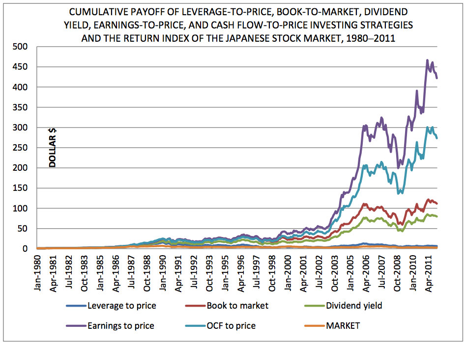
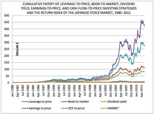
They also investigated the cumulative payoff in dollar terms of investing $1 in the portfolios having the highest values of our value measures with monthly portfolio rebalancing in the 1980–2011 period. Value investing strategies based on stock’s book-to-market, dividend yield, earning-to-price , cash flow-to-price , and leverage-to-price grew $1 into $115.98, $81.88, $433.86, $281.49, and $6.62 respectively, while the aggregate stock market turned $1 into a mere $2.76, in the 1980–2011 period. This implies that these value investing strategies rewarded investors 42.0, 29.6, 157, 102 and 2.40 times what the Japanese stock market did. The effective monthly compound returns of the various investing strategies are 1.25 percent, 1.16 percent, 1.60 percent, 1.48 percent and 0.49 percent, while the aggregate stock market only delivered 0.27 percent in this period.

Japan Value

Four out of five value investing strategies actually rewarded investors with positive returns in the bear market that spanned two decades from 1990 to 2011, turning $1 into $4.77, $4.25, $17.17, and $10.91, implying profits of 377 percent, 325 percent, 1617 percent, and 991 percent respectively, while the stock market plunged 62.21 percent after reaching its peak in January 1990. In addition, every one of these value investing strategies continued to generate positive returns between the pre-global financial crisis peak in 2007 and December 2011.

Order Quantitative Value from Wiley FinanceAmazon, or Barnes and Noble.

Click here if you’d like to read more on Quantitative Value, or connect with me on LinkedIn.

The CFAInstitute blog Inside Investing has a great post on the returns to negative enterprise value stocks. Alon Bochman, CFA has investigated the performance of all negative enterprise value (“EV”) stocks trading in the United States between March 30, 1972 and September 28, 2012. He used balance sheet data from Standard & Poor’s Compustat database and merged these data with price data from the database maintained by the Center for Research in Security Prices (CRSP). He then calculated historical EVs for every company every month, as well as matching forward 12-month returns. Says Alon:

I found 2,613 stocks that at one point or another traded at a negative enterprise value between 1972 and 2012 (Microsoft, unfortunately, was not among them). The list has one entry per stock-month. That is, a stock that has traded at a negative enterprise value three months in a row will appear on the list three times. Each time is a different investment opportunity with its own forward 12-month return. The average stock spent 10.17 months (not necessarily consecutive) in negative EV territory. Thus, the list shows a total of 26,569 opportunities to invest in negative EV stocks.

The average return across all 26,569 opportunities was 50.4%. That is, if you had diligently watched the market over the last 40 years and invested $1,000 into each negative EV stock each month, your average investment would be worth $1,504 after holding that investment for one year, not including trading costs, taxes, and so on. Not bad!

Most of the opportunities are in micro caps with limited liquidity:

Returns by Market Cap -- Negative EV Investing

Alon notes that these opportunities have come up with some regularity and have usually provided attractive returns but have on occasion lost a great deal as well:

Average 12M Returns on Negative EV Stocks by Entry Year

Read Returns on Negative Enterprise Value Stocks: Money For N0thing?

Order Quantitative Value from Wiley FinanceAmazon, or Barnes and Noble.

Click here if you’d like to read more on Quantitative Value, or connect with me on LinkedIn.

Further to this post Value Badly Lagging Glamour: The Value Premium Is Now A Discount Saj Karsan requested a calculation showing the value premium using EBIT/EV:

This chart shows the average annual value premium calculated using EBIT / EV (decile 10 — decile 1) from the largest 50 percent of non-financial stocks listed in the US for the period 1999 to present.

EBIT Value PremiumThe horizontal red line is the average EBIT/EV value premium for the period at 5.4 percent. 2009 aside, the value premium has been negative since 2007 (although there is a very small premium for the incomplete 2013 year to date). Even so, the magnitude of the return in 2009 means that, in aggregate since 2007, the value premium is still slightly positive.

Order Quantitative Value from Wiley FinanceAmazon, or Barnes and Noble.

Click here if you’d like to read more on Quantitative Value, or connect with me on LinkedIn.

Two interesting charts from The Brandes Institute’s annual Value versus Glamour update for 2013. The first exhibit (2) shows the disappearance of the value premium over the last five years, and its inversion over the last two years. The yellow dotted line shows the average returns to the ten decile portfolios of stocks ranked by price-to-book value from 1968 to 2012. It demonstrates that, historically, the higher the price-to-book value, the lower the returns. The differential between the returns to the stocks in decile 10 (the “value” portfolio) and decile 1 (the “glamour” portfolio) is the value premium. That relationship seems to have broken down since 2007 (shown in blue), and inverted since 2010 (shown in red). The value premium is now a value discount!US Value Premium

The second exhibit (3) shows the rolling five-year annualized relative performance of value over glamour. In the last two rolling five-year periods, value stocks in the U.S.–marked in yellow–have delivered their worst relative performance in the 32 years of data from 1980. The Non-U.S. value stocks have continued to outperform.Rolling Five-Year Value versus GlamourAs the second exhibit demonstrates, it’s unusual for value to underperform glamour by so much and for so long. The last period of underperformance occurred in 2000, and it wasn’t as deep or prolonged. One possible explanation is that low p/b value strategies are now so well known and low p/b value stocks are so picked over that value investors have to do something special to outperform. More likely is that this is a brief period of underperformance at the tail end of a bull market and the relative performance of value over subsequent periods will compensate.

Order Quantitative Value from Wiley FinanceAmazon, or Barnes and Noble.

Click here if you’d like to read more on Quantitative Value, or connect with me on LinkedIn.

This issue of Barron’s carries a brief article on activist hedge funds and makes mention of activist Jeff Ubben and his firm ValueAct Capital, which is regarded as one of the elite activist funds because it has averaged gains of 144 percent in companies where they filed 13D forms.

Some notable holdings include:

  • ADOBE SYSTEMS INC
  • CBRE GROUP INC
  • MCGRAW HILL
  • MICROS SYSTEMS INC
  • MICROSOFT CORP
  • MOTOROLA SOLUTIONS INC
  • MSCI INC
  • VALEANT PHARMACEUTICALS INTL

You can see a list of their most recent holdings here.

Ubben is speaking at the 9th Annual New York Value Investing Congress taking place September 16 & 17, 2013 at Jazz at Lincoln Center’s Fredrick P. Rose Hall.

Ubben will be accompanied by some of the world’s most accomplished investors, and for good reason: they want to be the first to hear investment ideas from money managers who have a proven track record of generating stellar returns for their clients and themselves.

Readers of Greenbackd can save $1,700 by registering now with discount code N13GB2 before Thursday, June 27th.

Here’s the updated St Louis Fed’s FRED on Warren Buffett’s favored market measure, total market capitalization-to-GNP:

FRED Graph

The Q1 2013 ratio – the most recent point – is 110 percent.

According to the FRED data, the Q1 2000 TTM/GNP peak ratio was 158 percent, and the Q3 2007 TTM/GNP peak was 114 percent. The average for the full period – Q3 1949 to Q3 2012 – is 69 percent. The last time the market traded at a below-average ratio was Q1 2009.

Here’s the log version:

FRED Graph

Order Quantitative Value from Wiley FinanceAmazon, or Barnes and Noble.

Click here if you’d like to read more on Quantitative Value, or connect with me on LinkedIn.

In Is the AAII Sentiment Survey a Contrarian Indicator? Charles Rotblut, CFA asks if the AAII Sentiment Survey results signal future market direction.

Each week from Thursday 12:01 a.m. until Wednesday at 11:59 p.m. the AAII asks its members a simple question:

Do you feel the direction of the stock market over the next six months will be up (bullish), no change (neutral) or down (bearish)?

AAII members participate by visiting the Sentiment Survey page (www.aaii.com/sentimentsurvey) on AAII.com and voting.

Bullish sentiment has averaged 38.8% over the life of the survey. Neutral sentiment has averaged 30.5% and bearish sentiment has averaged 30.6% over the life of the survey.

In order to determine whether there is a correlation between the AAII Sentiment Survey and the direction of the market, Rotblut looked at instances when bullish sentiment or bearish sentiment was one or more standard deviations away from the average. He then calculated the performance of the S&P 500 for the following 26-week (six-month) and 52-week (12-month) periods. The data for conducting this analysis is available on the Sentiment Survey spreadsheet, which not only lists the survey’s results, but also tracks weekly price data for the S&P 500 index.

Table 2 from the article has the results:

Table 2. Performance of Sentiment Survey as a Contrarian Indicator

Sentiment Level Number of
Observations
Average
S&P 500
Change
(%)
Median
S&P 500
Change
(%)
% of
Periods
Correctly
Contrarian
(%)
6-Month Performance
Bullish > +3 S.D. From Mean
2.0
7.4
7.4
0.0
Bullish > +2 S.D. From Mean
44.0
-0.7
0.3
48.0
Bullish > +1 S.D. From Mean
167.0
0.8
2.9
34.0
Bullish < –1 S.D. From Mean
212.0
6.9
6.2
80.0
Bullish < –2 S.D. From Mean
16.0
14.0
17.7
100.0
Bearish > +3 S.D. From Mean
3.0
25.8
23.0
100.0
Bearish > +2 S.D. From Mean
50.0
2.8
5.3
60.0
Bearish > +1 S.D. From Mean
162.0
4.7
6.0
71.0
Bearish < –1 S.D. From Mean
211.0
3.8
4.5
26.0
Bearish < –2 S.D. From Mean
9.0
-5.5
-1.7
67.0
All
1,319.0
4.0
4.7
12-Month Performance
Bullish > +3 S.D. From Mean
2.0
3.6
3.6
50.0
Bullish > +2 S.D. From Mean
44.0
-2.0
3.6
48.0
Bullish > +1 S.D. From Mean
167.0
2.4
6.3
31.0
Bullish < –1 S.D. From Mean
206.0
12.9
14.3
84.0
Bullish < –2 S.D. From Mean
16.0
20.7
21.7
100.0
Bearish > +3 S.D. From Mean
3.0
35.0
25.6
100.0
Bearish > +2 S.D. From Mean
50.0
3.1
14.3
60.0
Bearish > +1 S.D. From Mean
152.0
7.1
11.8
74.0
Bearish < –1 S.D. From Mean
211.0
7.7
9.9
24.0
Bearish < –2 S.D. From Mean
9.0
-4.3
4.8
44.0
All
1,293.0
8.4
10.2
Based on data from July 24, 1987, to May 2, 2013. Numbers are rounded.

Rotblut observes:

Neither unusual nor extraordinarily high levels of optimism are highly correlated with declining stock prices when the entire survey’s history is considered. The 44 periods with bullish sentiment readings more than two standard deviations above average were followed by a six-month fall in the S&P 500 only 48% of the time. The average six-month decline was 0.7%.

Extraordinarily high levels of pessimism have a mixed record of being correlated with higher stock prices. On a six-month basis, the S&P 500 rose 60% of the time following a bearish sentiment reading more than two standard deviations above the historical mean. The average and median gains were 2.8% and 5.3%, respectively. On a 12-month basis, the S&P 500 rose 60% of the time, with an average gain of 3.1% and a median gain of 14.3%. The average increases in prices are well below the typical increases realized throughout the entire history of the survey, though the median increases are greater than the typical gains.

Read Is the AAII Sentiment Survey a Contrarian Indicator?

Order Quantitative Value from Wiley FinanceAmazon, or Barnes and Noble.

Click here if you’d like to read more on Quantitative Value, or connect with me on LinkedIn.

Margin debt in the United States — money borrowed against securities in brokerage accounts — has risen to its highest level ever, at $384 billion, surpassing the previous peak of $381 billion set in July 2007 according to New York Times Business Day’s Off The Charts: Sign of Excess?. Margin debt as a proportion of GDP is not quite yet at the peak set in 2007, but it has exceeded 2.25% only twice previously in the last 50 years–2000 and 2007. The bottom panel shows that each of those instances was followed by a large drawdown:

NYT Margin Debt

Read Off The Charts: Sign of Excess?

Order Quantitative Value from Wiley FinanceAmazon, or Barnes and Noble.

Click here if you’d like to read more on Quantitative Value, or connect with me on LinkedIn.

h/t SD.

Butler|Philbrick|Gordillo & Associates is out with a great new post “Triumph of the Ostriches” discussing the market’s current level of overvaluation. Here is the summary of Butler|Philbrick|Gordillo’s forecasts:

Table 1. Statistical Return Forecasts for U.S. Stocks Over Relevant Investment Horizons

Source: Shiller (2013), DShort.com (2013), Chris Turner (2013), World Exchange Forum (2013), Federal Reserve (2013), Butler|Philbrick|Gordillo & Associates (2013)

Butler|Philbrick|Gordillo comment:

We have yet to see any evidence-based argument for why the valuation based analysis presented above is not relevant. What do we mean by ‘evidence based’? Show us numbers to support an alternative hypothesis, and then show me how those numbers have served to forecast returns in other periods with statistical significance.

Other memes relate to the idea of a ‘permanently high plateau’ (incidentally, the great 20th century economist Irving Fisher coined that phrase in 1929, just three days before the crash that preceded the Great Depression). Purveyors of this delusion cite the current ‘pollyanna’ environment for global corporations as validation for stratospheric equity valuations. “Corporations have high record cash positions”, they crow, “get ready for the great buy back and merger wave that’s coming!” “Profit margins are high, corporate taxes are near all-time lows, wage pressures are non-existent – corporations have never had it better! Oh and financing is effectively free!”

Unfortunately the wailing equity zealots do not factor in Stein’s Law, which states, “If something cannot go on forever, it will stop.” In a period of record fiscal duress, what is the probability that corporations will continue to receive favourable tax status? According to GMO’s analysis, corporate profit margins are one of the most mean-reverting series in finance, so why would be value markets under the assumption that they will stay high forever? Further, how valuable is the cash on corporate balance sheets if there is an equally large debt balance on the other side of the ledger (there is)?

The Ostriches aren’t concerned with valuation metrics or Stein’s Law, and let’s face it, they’ve been right to stick their head in the sand – at least so far. The problem is that in markets we won’t know who is right until the bottom of the final cyclical bear in this ongoing secular bear market. Only then will we see just how far from fundamentals the authorities have managed to push prices, and only then will we see whether it really is different this time.

Until then, investors can choose facts or faith. The facts say that investors are unlikely to be compensated at current valuations for the risks of owning stocks over the next few years. The church of equities says, ‘don’t worry about it’. So far the Ostriches have it, but all meaningful evidence suggests that over the next few years the Ostriches are going to feel like turkeys – at Thanksgiving.

Read Triumph of the Ostriches.

Order Quantitative Value from Wiley FinanceAmazon, or Barnes and Noble.

Click here if you’d like to read more on Quantitative Value, or connect with me on LinkedIn.