Feeds:
Posts
Comments

Archive for April, 2013

Montier Corporate Profit Margins

Source: “What Goes Up Must Come Down!” James Montier (March 2012)

In his recent piece The Endgame is Forced Liquidation John Hussman eloquently describes the reason why investors need to be wary of structural arguments intended to dispose of indicators with a very reliable cyclical record:

On the temptation to disregard proven indicators

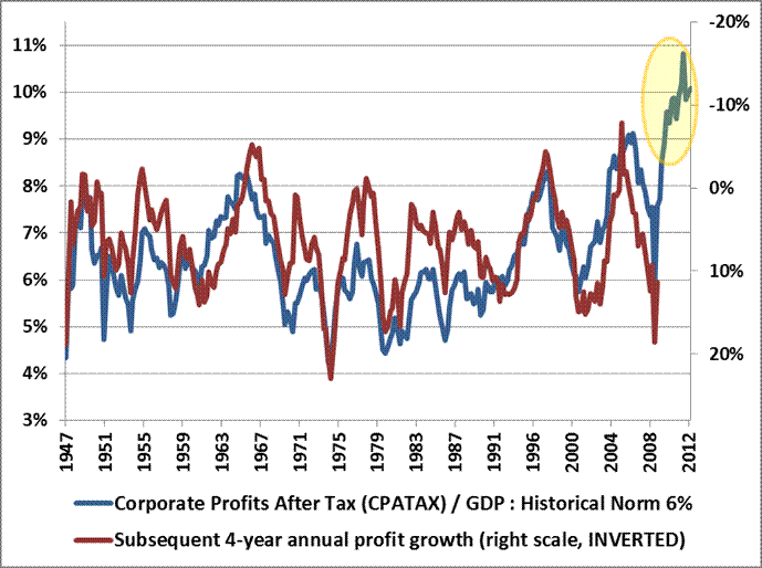
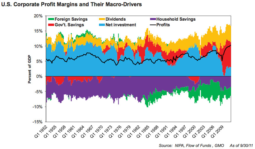
As a side-note, it’s important for investors to be wary of “structural” arguments intended to discard indicators that have very reliable cyclical records. For example, hardly a day goes by that we don’t see an attempt to harness some long-term structural factor, such as increasing globalization of trade, to explain away the spike in profit margins over the past few years – in the hope of proving that these margins will be permanent this time. Some of these arguments are discussed in recent weekly comments. But these factors don’t explain the cyclical fluctuations in profit margins at all, and can’t be used to discard the accounting relationships and decades of evidence that corporate profits have a strong secular and tight cyclical mirror-image relationship with the combined total of government and household savings.

Investors get themselves in trouble when they embrace “new economy” theories not because those new theories can be demonstrated in the data; not because existing approaches fail to fully explain the subsequent historical outcomes; but solely because time-tested approaches suggest uncomfortable outcomes in the present instance.

The same sort of structural second-guessing is evident in the gold market here – a good example of what forced liquidation looks like, as my impression is that leveraged longs have been forced into a fire-sale in recent weeks, creating good values for longer-term investors, but with continued near-term risks.  If we look at the ratio of gold prices to the Philadelphia gold index (XAU), we do believe there are structural factors that affect that ratio (primarily the increasing cost of extracting gold over time). But these don’t explain away or eliminate the strong cyclical relationship between the gold/XAU ratio and subsequent returns on the XAU over the following 3-4 year periods. So while we don’t believe that the record high gold/XAU ratio can be taken entirely at face value, there’s no question that it is elevated even on a cyclical basis (that is, even allowing for a gradual structural increase over time), and there’s no question in the data that cyclically elevated gold/XAU ratios have been associated with strong subsequent gains in the XAU index over a 3-4 year period on average, though certainly not without risk or volatility.

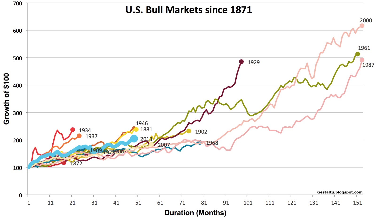
As a final example, some analysts (such as the Dow 36,000 authors) have argued that the proper risk premium on stocks, relative to Treasury securities, should be zero. This line of argument was used in 2000 to suggest that stocks were still cheap despite high apparent valuations. But this “secular” argument for high valuations ultimately did not weaken the long-term evidence and tight cyclical relationship between valuations and subsequent market returns. Despite all the new economy arguments about productivity growth,  the internet, globalization, the great moderation, and the outdated relevance of risk premiums, stocks still went on to lose half their value over the next two years, and to produce negative returns over the decade that followed.

The bottom line is that it becomes very tempting – both in speculative markets and fearful ones – to discard well-proven indicators as meaningless by arguing that some “structural” change in the market or the economy makes things different this time. True, those arguments can sometimes be used to explain very long-term changes in the level of an indicator. But even then, new economy arguments are typically ineffective at explaining away the informative cyclical variations in good indicators. Be particularly hesitant about ignoring indicators whose cyclical variations have been effective even in recent data, as is true of the ability of time-tested valuation approaches to explain subsequent 10-year market returns even during the period since the late-1990’s, and the ability of government and household savings to tightly explain cyclical swings in profit margins and subsequent profit growth, even in the most recent economic cycle.

Order Quantitative Value from Wiley FinanceAmazon, or Barnes and Noble.

Click here if you’d like to read more on Quantitative Value, or connect with me on LinkedIn.

h/t Joe

Advertisement

Read Full Post »

Corporate profit margins are presently 70 percent above the historical mean going back to 1947, as I’ve discussed earlier (see, for example, Warren Buffett, Jeremy Grantham, and John Hussman on Profit, GDP and Competition). John Hussman attributes it to the record negative low in combined household and government savings:

The deficit of one sector must emerge as the surplus of another sector. Corporations benefit from deficit spending despite wages at record lows as a share of economy.

John Hussman spoke recently at the 2013 Wine Country conference. Here he describes the relationship between corporate profits, and government, and household savings (starting at 22.08):

Hussman’s whole talk is well worth hearing.

Order Quantitative Value from Wiley FinanceAmazon, or Barnes and Noble.

Click here if you’d like to read more on Quantitative Value, or connect with me on LinkedIn.

h/t Meb Faber

Read Full Post »

headerBkgnd

We wrote an article for the April issue of Value Investing Letter giving an overview of Quantitative Value, discussing the quantitative value model outlined in the book, and applying it to Apple Inc. (AAPL). It’s been smashed up since then, and there was also some big news yesterday — which is that AAPL is going to return $100 billion to its shareholders by the end of 2015 — so I’m highlighting it here. To put that $100 billion capital return in context, AAPL closed Tuesday with a market capitalization of $380 billion. Incredibly, its $145 billion cash pile won’t shrink because the new buyback brings its return of capital up to about the level of its current free cash flow. Weirdly, it’s now regarded as the “animal investors like least: a slow-growing tech stock.” From our earlier article:

We ran our model on March 13, 2013, finding Apple Inc. (AAPL) to be one of the highest quality stocks in the bargain bin. AAPL designs, manufactures and markets a variety of mobile devices, including the iPhone, iPad, and iPod, along with Mac products, operating systems, cloud products, related software and services, and many other products. Its devices are ubiquitous, and are catnip to consumers, driving one of the most valuable brands in the world. Why has the company shed over a third of its market capitalization since peaking near $700 per share in September of 2012?

In short, this former hedge fund darling has become the company that everyone loves to hate. iPod and Mac sales are down from last year. The media has pounced on reports of weakness in the sale of the iPhone 5 and now questions whether AAPL will be competitive with the newest smartphones. The market did not react well to AAPL’s latest earnings announcement, and dozens of analysts have reduced their price targets over the past few months. So what’s going on here? Is AAPL again headed for the technology dustbin of history? Or might this be a manifestation of investors’ behavioral bias?

Our model leads us to believe that AAPL offers exceptional franchise characteristics and is statistically cheap, with an EBIT/TEV yield of nearly 21 percent, which is among the very cheapest within the cheapest decile of stocks in the market. Below are some additional highlights from the quantitative output of our screens, which will give the reader a high-level view of the company’s profile, and then we will dig deeper on some details. Clearly, the fact that Mr. Market is offering us a company of this quality at this price should raise some questions.

AAPL Summary Statistics (As At March 13, 2013)

(Click to enlarge)

AAPL

To continue reading the article please click here.

Buy my book Deep Value: Why Activist Investors and Other Contrarians Battle for Control of Losing Corporations (hardcover or Kindle, 240 pages, Wiley Finance) from Wiley Finance, Amazon, or Barnes and Noble.

Here’s your book for the fall if you’re on global Wall Street. Tobias Carlisle has hit a home run deep over left field. It’s an incredibly smart, dense, 213 pages on how to not lose money in the market. It’s your Autumn smart read. –Tom Keene, Bloomberg’s Editor-At-Large, Bloomberg Surveillance, September 9, 2014.

Click here if you’d like to read more on Deep Value, or connect with me on Twitter, LinkedIn or Facebook. Check out the best deep value stocks in the largest 1000 names for free on The Acquirer’s Multiple.

No position.

Read Full Post »

Value Line’s Median Appreciation Potential (VLMAP) 2009

3to5year4yrchart10-8-10

Marketwatch’s Mark Hulbert has a great article Finding the best four-year market forecaster examining Value Line’s Median Appreciation Potential (VLMAP), which is the median three-to-five year gain that Value Line’s analysts estimate for the 1,700 stocks they cover.

From Value Line October 2010 update:

The estimate of the median price appreciation potential is found by first calculating the percentage change between the current price of each stock in our universe and the middle of its 3- to 5-year Target Price Range. These figures are then arrayed, and the median price appreciation potential is determined. We select the median of the array (the middle) as the most likely price, in order to play down the effect of outliers, that is, excessively large or small percentage price changes.

The chart included [above] depicts the results of those projections from 1983 to 2009, using the Value Line Arithmetic Index as our measure of the market. The actual price is taken as the average of the middle year of the 3- to 5-year forecast, so that a projection made at the end of 1983 would be compared to the average price of the index in 1987. Accordingly, we are comparing actual results to a 3 ½ year forecast.

Those who follow the VLMAP often adjust it downward when translating it into a forecast because Value Line’s analysts — like most of Wall Street (see my post on forward earnings) — are on average too optimistic. Note that the 2009 projection has turned out to be roughly right:

Our estimate for the year 2009 (made at the end of 2005) was 2683. The average price of the Value Line Arithmetic Index in 2009 was 1758. The large deviation arises from the effects of the recession that followed in the wake of the financial turmoil in late 2008 and early 2009. Meanwhile, the average deviation between the projected and actual average prices during this period was 18% (ignoring signs). The median deviation during this period was 11%. The projection for 2013 now stands at 3500. The 4-year projected price of 3500 now stands at 40% above the current level—suggesting respectable returns for patient investors.

The market closed Friday at 3,444. Why does this model work so well?

Mark Robertson, founder and managing partner of the Detroit-based advisory service Manifest Investing, also uses a version of the VLMAP. He thinks one answer lies in the willingness of Value Line’s analysts to focus on a longer-term horizon than is typical for most Wall Street analysts.

It may seem “counterintuitive,” he acknowledges, but “long-term forecasting is actually easier and more accurate than the quarterly whispering and chasing that we see from and on Wall Street.”

Because they are focusing on where the stocks they follow will be trading in three- to five-years’ time, Value Line’s analysts are less likely to get swept away by whatever mood has captured Wall Street’s attention, Robertson says.

Compared with analysts who focus on just the next couple of quarters, for example, Value Line’s are less likely to adjust their price targets based on the latest earnings. This makes them less inclined to get more bullish as the market goes higher — a tendency that leads to being excessively bullish at market tops.

Over the past five years the VLMAP has been as low as 45 percent and as high as 185 percent. It currently stands at 50 percent, which is close to the five-year low and only slightly higher than the 35 percent estimate logged in the weeks leading up to the bull-market high in October 2007.

Read Finding the best four-year market forecaster.

Order Quantitative Value from Wiley FinanceAmazon, or Barnes and Noble.

Click here if you’d like to read more on Quantitative Value, or connect with me on LinkedIn.

Read Full Post »

Ratio of Corporate Profits-to-GDP and Returns (1947 to Present)

Source: Hussman Weekly Comment “Taking Distortion at Face Value,” (April 8, 2013)

Warren Buffett, 1999

[F]rom 1951 on, the percentage settled down pretty much to a 4% to 6.5% range.

In my opinion, you have to be wildly optimistic to believe that corporate profits as a percent of GDP can, for any sustained period, hold much above 6%. One thing keeping the percentage down will be competition, which is alive and well.

— Warren Buffett, Mr. Buffett on the Stock Market (November 1999)

Jeremy Grantham, 2006

Profit margins are probably the most mean-reverting series in finance, and if profit margins do not mean-revert, then something has gone badly wrong with capitalism. If high profits do not attract competition, there is something wrong with the system and it is not functioning properly.

— Jeremy Grantham, Barron’s (c. 2006), via Katsenelson, The Little Book of Sideways Markets.

John Hussman, 2013

In general, elevated profit margins are associated with weak profit growth over the following 4-year period. The historical norm for corporate profits is about 6% of GDP. The present level is about 70% above that, and can be expected to be followed by a contraction in corporate profits over the coming 4-year period, at a roughly 12% annual rate. This will be a surprise. It should not be a surprise.

— John Hussman, Two Myths and a Legend (March 11, 2013)

h/t Butler|Philbrick|Gordillo and Associates

Order Quantitative Value from Wiley FinanceAmazon, or Barnes and Noble.

Click here if you’d like to read more on Quantitative Value, or connect with me on LinkedIn.

Read Full Post »

Butler|Philbrick|Gordillo and Associates have an interesting post called What the Bull Giveth, the Bear Taketh Away on the duration and magnitude of all bull and bear market periods in U.S. stocks since 1871.

For the purpose of the study below, we examined the S&P 500 price series from Shiller’s publicly available database to understand the duration and magnitude of all bull and bear market periods in U.S. stocks since 1871. We defined a bear market as a drop in prices of at least 20% from any peak, and which lasted at least 3 months. Bull markets were then defined as a rise of at least 50% from the bottom of a bear market, over a period lasting at least 6 months.

Chart 1 and Table 1 describe every bull market since 1871 in the S&P, including duration and magnitude information. The lesson from this analysis is uninspiring for equity bulls, as we will see. The core hurdle is that the current bull market has (through end of February) already delivered 105% of gains, against the median 124% bull market run through history (using monthly data). Of course, this means that, should this bull market deliver an average surge, investors can hope for less than 20% more growth from this cycle. Further, given that the median bull market has historically lasted 50 months, and we are currently in our 49th bull month, we are about due for a wipeout.

Chart 1. Bull Markets since 1871

Source: Shiller (2013)

Table 1. Bull Markets since 1871 – Statistics

Source: Shiller (2013)

The current bull market has already delivered 85 percent of the gains, and lasted about as long, as the median historical bull market.

Read What the Bull Giveth, the Bear Taketh Away for the bear market equivalents of the preceding bull table and chart. Butler|Philbrick|Gordillo and Associates demonstrate that, if it follows the median bear market, it will wipe out 38 percent of all prior gains.

Buy my book The Acquirer’s Multiple: How the Billionaire Contrarians of Deep Value Beat the Market from on Kindlepaperback, and Audible.

Here’s your book for the fall if you’re on global Wall Street. Tobias Carlisle has hit a home run deep over left field. It’s an incredibly smart, dense, 213 pages on how to not lose money in the market. It’s your Autumn smart read. –Tom Keene, Bloomberg’s Editor-At-Large, Bloomberg Surveillance, September 9, 2014.

Click here if you’d like to read more on The Acquirer’s Multiple, or connect with me on Twitter, LinkedIn or Facebook. Check out the best deep value stocks in the largest 1000 names for free on the deep value stock screener at The Acquirer’s Multiple®.


Read Full Post »

Butler|Philbrick|Gordillo and Associates’ argue in Valuation Based Equity Market Forecasts – Q1 2013 Update that “there is substantial value in applying simple statistical models to discover average estimates of what the future may hold over meaningful investment horizons (10+ years), while acknowledging the wide range of possibilities that exist around these averages.”

Butler|Philbrick|Gordillo use linear regression to examine several variations of the Shiller PE (and other cyclically adjusted PE ratios over periods ranging from one to 30 years), Tobin’s q ratio and Buffett’s total market capitalization-to-gross national product ratio (“TMC/GNP”). They have analyzed the power of each measure to explain inflation-adjusted stock returns including reinvested dividends over subsequent multi-year periods, setting their findings out in the following matrix:

Matrix 1. Explanatory power of valuation/future returns relationships

Source: Shiller (2013), DShort.com (2013), Chris Turner (2013), World Exchange Forum (2013), Federal Reserve (2013), Butler|Philbrick|Gordillo & Associates (2013).
Butler|Philbrick|Gordillo comment:
Matrix 1. contains a few important observations. Notably, over periods of 10-20 years, the Q ratio, very long-term smoothed PE ratios, and market capitalization / GNP ratios are equally explanatory, with R-Squared ratios around 55%.  The best estimate (perhaps tautologically given the derivation) is derived from the price residuals, which simply quantify how extended prices are above or below their long-term trend.The worst estimates are those derived from trailing 12-month PE ratios (PE1 in Matrix 1 above). Many analysts quote ‘Trailing 12-Months’ or TTM PE ratios for the market as a tool to assess whether markets are cheap or expensive. If you hear an analyst quoting the market’s PE ratio, odds are they are referring to this TTM number. Our analysis slightly modifies this measure by averaging the PE over the prior 12 months rather than using trailing cumulative earnings through the current month, but this change does not substantially alter the results.As it turns out, TTM (or PE1) Price/Earnings ratios offer the least information about subsequent returns relative to all of the other metrics in our sample. As a result, investors should be extremely skeptical of conclusions about market return prospects presented by analysts who justify their forecasts based on trailing 12-month ratios.

Butler|Philbrick|Gordillo note:

Our analysis provides compelling evidence that future returns will be lower when starting valuations are high, and that returns will be higher in periods where starting valuations are low.

So where are we now? Table 1 below from the post provides a snapshot of some of the results from Butler|Philbrick|Gordillo’s analysis. The table shows estimated future returns based on an aggregation of several factor models over some important investment horizons:

Table 1. Factor Based Return Forecasts Over Important Investment Horizons

Source: Shiller (2013), DShort.com (2013), Chris Turner (2013), World Exchange Forum (2013), Federal Reserve (2013), Butler|Philbrick|Gordillo & Associates (2013)

Butler|Philbrick|Gordillo note that:
You can see from the table that, according to a model that incorporates valuation estimates from 4 distinct domains, and which explains over 80% of historical returns since 1871, stocks are likely to deliver 1% or less in real total returns over the next 5 to 20 years. Yikes.

They conclude:

[T]he physics of investing in expensive markets is that, at some point in the future, perhaps years from now, the market has a very high probability of trading back below current prices; perhaps far below.

The post is a well-researched, and comprehensive analysis of several long-term market-level valuation measures. It is a worthy contribution to the research in this area. Read Valuation Based Equity Market Forecasts – Q1 2013 Update.

Order Quantitative Value from Wiley FinanceAmazon, or Barnes and Noble.

Click here if you’d like to read more on Quantitative Value, or connect with me on LinkedIn.

Read Full Post »

In Fat Tails: How The Equity Q Ratio Anticipates Stock Market Crashes and The Equity Q Ratio: How Overvaluation Leads To Low Returns and Extreme Losses I examined Universa Chief Investment Officer Mark Spitznagel’s June 2011 working paper The Dao of Corporate Finance, Q Ratios, and Stock Market Crashes (.pdf), and the May 2012 update The Austrians and the Swan: Birds of a Different Feather (.pdf), which discuss the “clear and rigorous evidence of a direct relationshipbetween overvaluation measured by the equity q ratio and “subsequent extreme losses in the stock market.”

Spitznagel argues that at valuations where the equity q ratio exceeds 0.9, the 110-year relationship points to an “expected (median) drawdown of 20%, and a 20% chance of a larger than 40% correction in the S&P500 within the next few years; these probabilities continually reset as valuations remain elevated, making an eventual deep drawdown from current levels highly likely.”

So where are we now?

Smithers & Co. tracks the equity q ratio for the US. The chart below shows each to its own average on a log scale.

According to Smithers & Co., the equity q ratio currently stands at 1.05, which is some 17 percent above 0.9, the ratio at which “an “expected (median) drawdown of 20%, and a 20% chance of a larger than 40% correction in the S&P500 within the next few years.” Smithers & Co. note:

Both q and CAPE include data for the year ending 31st December, 2012. At that date the S&P 500 was at 1426 and US non-financials were overvalued by 44% according to q and quoted shares, including financials, were overvalued by 52% according to CAPE. (It should be noted that we use geometric rather than arithmetic means in our calculations.)

As at 12th March, 2013 with the S&P 500 at 1552 the overvaluation by the relevant measures was 57% for non-financials and 65% for quoted shares.

Although the overvaluation of the stock market is well short of the extremes reached at the year ends of 1929 and 1999, it has reached the other previous peaks of 1906, 1936 and 1968.

Like the Shiller PE and Buffett’s total market capitalization-to-gross national product measure, the equity q ratio is a poor short-term market timing device. This is because there are no reliable short-term market timing devices. If one existed, its effect would be rapidly arbitraged away. So why look market-level valuation measures? From Smithers & Co.:

Understanding value is vital for investors.

(i) It provides a sound way of assessing the probable returns over the medium-term.

(ii) It provides information about the current risks of stock market investment.

(iii) It enables investors to avoid nonsense claims about value.

Extreme discipline is required at market extremes. Gladwell’s profile of Taleb, Blowing Up, shows how difficult such periods can be:

Empirica has done nothing but lose money since last April. “We cannot blow up, we can only bleed to death,” Taleb says, and bleeding to death, absorbing the pain of steady losses, is precisely what human beings are hardwired to avoid. “Say you’ve got a guy who is long on Russian bonds,” Savery says. “He’s making money every day. One day, lightning strikes and he loses five times what he made. Still, on three hundred and sixty-four out of three hundred and sixty-five days he was very happily making money. It’s much harder to be the other guy, the guy losing money three hundred and sixty-four days out of three hundred and sixty-five, because you start questioning yourself. Am I ever going to make it back? Am I really right? What if it takes ten years? Will I even be sane ten years from now?” What the normal trader gets from his daily winnings is feedback, the pleasing illusion of progress. At Empirica, there is no feedback. “It’s like you’re playing the piano for ten years and you still can’t play chopsticks,” Spitznagel say, “and the only thing you have to keep you going is the belief that one day you’ll wake up and play like Rachmaninoff.”

Finally, even though we can plainly see that markets are presently overvalued on several measures, we can’t know when a sell-off will occur. All we can say is that returns are likely to be sub-par for an extended period, and that the probabilities are quite high that a substantial drawdown will occur in the next two to three years. One thing that we can be sure of, is that when it does occur, the catalyst that ostensibly triggers the sell off will be treated as a black swan, even though the real cause is massive overvaluation. From the perspective of behavioral investment, this story of Gladwell’s is interesting:

In the summer of 1997, Taleb predicted that hedge funds like Long Term Capital Management were headed for trouble, because they did not understand this notion of fat tails. Just a year later, L.T.C.M. sold an extraordinary number of options, because its computer models told it that the markets ought to be calming down. And what happened? The Russian government defaulted on its bonds; the markets went crazy; and in a matter of weeks L.T.C.M. was finished. Spitznagel, Taleb’s head trader, says that he recently heard one of the former top executives of L.T.C.M. give a lecture in which he defended the gamble that the fund had made. “What he said was, Look, when I drive home every night in the fall I see all these leaves scattered around the base of the trees,?” Spitznagel recounts. “There is a statistical distribution that governs the way they fall, and I can be pretty accurate in figuring out what that distribution is going to be. But one day I came home and the leaves were in little piles. Does that falsify my theory that there are statistical rules governing how leaves fall? No. It was a man-made event.” In other words, the Russians, by defaulting on their bonds, did something that they were not supposed to do, a once-in-a-lifetime, rule-breaking event. But this, to Taleb, is just the point: in the markets, unlike in the physical universe, the rules of the game can be changed. Central banks can decide to default on government-backed securities.

US equity markets are very overvalued on a variety of measures. If Spitznagel’s thesis is correct that the frequency and magnitude of tail events increases with overvaluation, investors need to exercise caution given the extreme level of the equity q ratio. If the eventual event precipitating a sell off is a black swan, but we can expect black swans because of the market’s overvaluation, is it still a black swan?

Order Quantitative Value from Wiley FinanceAmazon, or Barnes and Noble.

Click here if you’d like to read more on Quantitative Value, or connect with me on LinkedIn.

Read Full Post »

Great piece from Tom Brakke’s research puzzle pix called “five years of junk” about the performance of junk bonds from 2008 to present, including the low in 2009. The top panel shows the returns, the middle the absolute yields, and the bottom spread versus treasuries (click to enlarge):

13 0410 five years of junk

Brakke notes two very interesting things:

First, notice how the market held together for many months up until the Lehman debacle. Not much warning from the market pricing mechanism even as the environment was deteriorating rapidly.  Second, these bonds bottomed well in advance of stocks.  (For your scorecard, from that bottom to 3/31, the CCCs returned 247%.)

Brakke’s conclusion is also worth noting:

Today we have a situation where investors have flocked in, even as the valuation picture has worsened as the yield cushion against inevitable problems has been depleted.  Nothing will necessarily happen tomorrow or the next day, but there’s no margin for error if something untoward does occur. 

Read Full Post »

In The Equity Q Ratio: How Overvaluation Leads To Low Returns and Extreme Losses I examined Universa Chief Investment Officer Mark Spitznagel’s June 2011 working paper The Dao of Corporate Finance, Q Ratios, and Stock Market Crashes (.pdf), and the May 2012 update The Austrians and the Swan: Birds of a Different Feather (.pdf), which discuss the “clear and rigorous evidence of a direct relationshipbetween overvaluation measured by the equity q ratio and “subsequent extreme losses in the stock market.”

Spitznagel argues that at valuations where the equity q ratio exceeds 0.9, the 110-year relationship points to an “expected (median) drawdown of 20%, and a 20% chance of a larger than 40% correction in the S&P500 within the next few years; these probabilities continually reset as valuations remain elevated, making an eventual deep drawdown from current levels highly likely.”

In his 2011 and 2012 papers, Spitznagel describes the equity q ratio as the “most robust aggregate overvaluation metric, which isolates the key drivers of valuation.” It is also useful in identifying “susceptibility to shifts from any extreme consensus,” which is important because “such shifts of extreme consensus are naturally among the predominant mechanics of stock market crashes.”

He observes that the aggregate US stock market has suffered very few sizeable annual losses (which Spitznagel defines as “20% or more”). Extreme stock market losses are by definition “tail events” as Figure 1 demonstrates.

Figure 1 shows how infrequently large drawdowns occur. However, when the equity q ratio is high, large losses are “no longer a tail event, but become an expected event.”

Figure 3 shows the magnitude of potential losses at various equity q ratios. In the last bucket (equity q > 0.9), the expected (median) drawdown is 20 percent, with a 1/5 chance of a greater than 40 percent correction in the S&P500 within the next few years. Spitznagel describes Figure 3 as “[t]he best picture I have ever seen depicting the endogenous risk control to be had from Benjamin Graham’s margin of safety principle (which insists on cheapness to conservative fundamental assumptions in one’s equity exposures, and thus provides added protection against errors in those assumptions).

Equity q ratios over 0.9 lead to some very ugly results. So where are we now? I’ll discuss it later this week.

Order Quantitative Value from Wiley FinanceAmazon, or Barnes and Noble.

Click here if you’d like to read more on Quantitative Value, or connect with me on LinkedIn.

Read Full Post »

Older Posts »

%d bloggers like this: