In Is the AAII Sentiment Survey a Contrarian Indicator? Charles Rotblut, CFA asks if the AAII Sentiment Survey results signal future market direction.
Each week from Thursday 12:01 a.m. until Wednesday at 11:59 p.m. the AAII asks its members a simple question:
Do you feel the direction of the stock market over the next six months will be up (bullish), no change (neutral) or down (bearish)?
AAII members participate by visiting the Sentiment Survey page (www.aaii.com/sentimentsurvey) on AAII.com and voting.
Bullish sentiment has averaged 38.8% over the life of the survey. Neutral sentiment has averaged 30.5% and bearish sentiment has averaged 30.6% over the life of the survey.
In order to determine whether there is a correlation between the AAII Sentiment Survey and the direction of the market, Rotblut looked at instances when bullish sentiment or bearish sentiment was one or more standard deviations away from the average. He then calculated the performance of the S&P 500 for the following 26-week (six-month) and 52-week (12-month) periods. The data for conducting this analysis is available on the Sentiment Survey spreadsheet, which not only lists the survey’s results, but also tracks weekly price data for the S&P 500 index.
Table 2 from the article has the results:
Table 2. Performance of Sentiment Survey as a Contrarian Indicator
| Sentiment Level |
Number of
Observations |
Average
S&P 500
Change
(%) |
Median
S&P 500
Change
(%) |
% of
Periods
Correctly
Contrarian
(%) |
| 6-Month Performance |
| Bullish > +3 S.D. From Mean |
2.0
|
7.4
|
7.4
|
0.0
|
| Bullish > +2 S.D. From Mean |
44.0
|
-0.7
|
0.3
|
48.0
|
| Bullish > +1 S.D. From Mean |
167.0
|
0.8
|
2.9
|
34.0
|
| Bullish < –1 S.D. From Mean |
212.0
|
6.9
|
6.2
|
80.0
|
| Bullish < –2 S.D. From Mean |
16.0
|
14.0
|
17.7
|
100.0
|
|
| Bearish > +3 S.D. From Mean |
3.0
|
25.8
|
23.0
|
100.0
|
| Bearish > +2 S.D. From Mean |
50.0
|
2.8
|
5.3
|
60.0
|
| Bearish > +1 S.D. From Mean |
162.0
|
4.7
|
6.0
|
71.0
|
| Bearish < –1 S.D. From Mean |
211.0
|
3.8
|
4.5
|
26.0
|
| Bearish < –2 S.D. From Mean |
9.0
|
-5.5
|
-1.7
|
67.0
|
| All |
1,319.0
|
4.0
|
4.7
|
|
| 12-Month Performance |
| Bullish > +3 S.D. From Mean |
2.0
|
3.6
|
3.6
|
50.0
|
| Bullish > +2 S.D. From Mean |
44.0
|
-2.0
|
3.6
|
48.0
|
| Bullish > +1 S.D. From Mean |
167.0
|
2.4
|
6.3
|
31.0
|
| Bullish < –1 S.D. From Mean |
206.0
|
12.9
|
14.3
|
84.0
|
| Bullish < –2 S.D. From Mean |
16.0
|
20.7
|
21.7
|
100.0
|
|
| Bearish > +3 S.D. From Mean |
3.0
|
35.0
|
25.6
|
100.0
|
| Bearish > +2 S.D. From Mean |
50.0
|
3.1
|
14.3
|
60.0
|
| Bearish > +1 S.D. From Mean |
152.0
|
7.1
|
11.8
|
74.0
|
| Bearish < –1 S.D. From Mean |
211.0
|
7.7
|
9.9
|
24.0
|
| Bearish < –2 S.D. From Mean |
9.0
|
-4.3
|
4.8
|
44.0
|
| All |
1,293.0
|
8.4
|
10.2
|
|
| Based on data from July 24, 1987, to May 2, 2013. Numbers are rounded. |
|
Rotblut observes:
Neither unusual nor extraordinarily high levels of optimism are highly correlated with declining stock prices when the entire survey’s history is considered. The 44 periods with bullish sentiment readings more than two standard deviations above average were followed by a six-month fall in the S&P 500 only 48% of the time. The average six-month decline was 0.7%.
…
Extraordinarily high levels of pessimism have a mixed record of being correlated with higher stock prices. On a six-month basis, the S&P 500 rose 60% of the time following a bearish sentiment reading more than two standard deviations above the historical mean. The average and median gains were 2.8% and 5.3%, respectively. On a 12-month basis, the S&P 500 rose 60% of the time, with an average gain of 3.1% and a median gain of 14.3%. The average increases in prices are well below the typical increases realized throughout the entire history of the survey, though the median increases are greater than the typical gains.
Read Is the AAII Sentiment Survey a Contrarian Indicator?
Order Quantitative Value from Wiley Finance, Amazon, or Barnes and Noble.
Click here if you’d like to read more on Quantitative Value, or connect with me on LinkedIn.
Read Full Post »
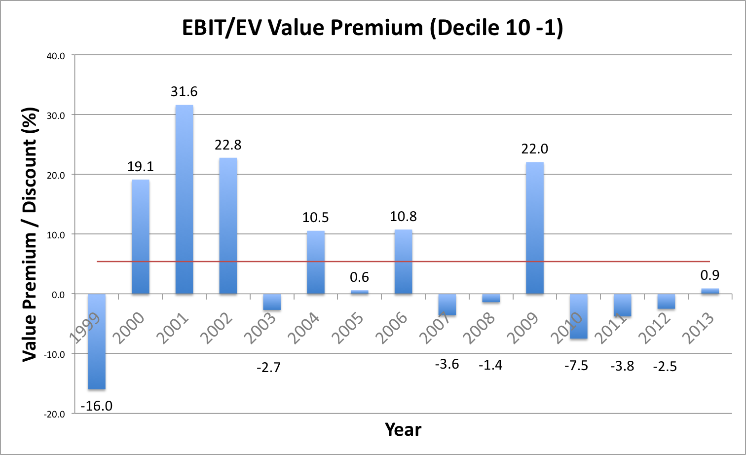 The horizontal red line is the average EBIT/EV value premium for the period at 5.4 percent. 2009 aside, the value premium has been negative since 2007 (although there is a very small premium for the incomplete 2013 year to date). Even so, the magnitude of the return in 2009 means that, in aggregate since 2007, the value premium is still slightly positive.