Feeds:
Posts
Comments

Archive for the ‘About’ Category

In Fat Tails: How The Equity Q Ratio Anticipates Stock Market Crashes and The Equity Q Ratio: How Overvaluation Leads To Low Returns and Extreme Losses I examined Universa Chief Investment Officer Mark Spitznagel’s June 2011 working paper The Dao of Corporate Finance, Q Ratios, and Stock Market Crashes (.pdf), and the May 2012 update The Austrians and the Swan: Birds of a Different Feather (.pdf), which discuss the “clear and rigorous evidence of a direct relationshipbetween overvaluation measured by the equity q ratio and “subsequent extreme losses in the stock market.”

Spitznagel argues that at valuations where the equity q ratio exceeds 0.9, the 110-year relationship points to an “expected (median) drawdown of 20%, and a 20% chance of a larger than 40% correction in the S&P500 within the next few years; these probabilities continually reset as valuations remain elevated, making an eventual deep drawdown from current levels highly likely.”

So where are we now?

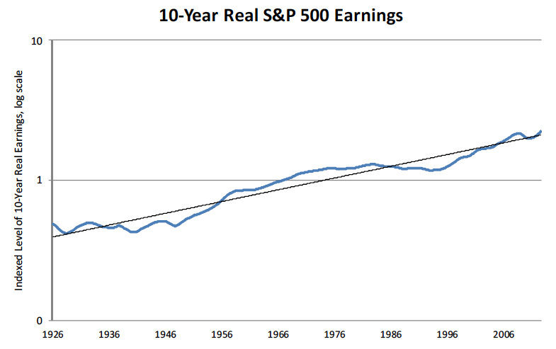
Smithers & Co. tracks the equity q ratio for the US. The chart below shows each to its own average on a log scale.

According to Smithers & Co., the equity q ratio currently stands at 1.05, which is some 17 percent above 0.9, the ratio at which “an “expected (median) drawdown of 20%, and a 20% chance of a larger than 40% correction in the S&P500 within the next few years.” Smithers & Co. note:

Both q and CAPE include data for the year ending 31st December, 2012. At that date the S&P 500 was at 1426 and US non-financials were overvalued by 44% according to q and quoted shares, including financials, were overvalued by 52% according to CAPE. (It should be noted that we use geometric rather than arithmetic means in our calculations.)

As at 12th March, 2013 with the S&P 500 at 1552 the overvaluation by the relevant measures was 57% for non-financials and 65% for quoted shares.

Although the overvaluation of the stock market is well short of the extremes reached at the year ends of 1929 and 1999, it has reached the other previous peaks of 1906, 1936 and 1968.

Like the Shiller PE and Buffett’s total market capitalization-to-gross national product measure, the equity q ratio is a poor short-term market timing device. This is because there are no reliable short-term market timing devices. If one existed, its effect would be rapidly arbitraged away. So why look market-level valuation measures? From Smithers & Co.:

Understanding value is vital for investors.

(i) It provides a sound way of assessing the probable returns over the medium-term.

(ii) It provides information about the current risks of stock market investment.

(iii) It enables investors to avoid nonsense claims about value.

Extreme discipline is required at market extremes. Gladwell’s profile of Taleb, Blowing Up, shows how difficult such periods can be:

Empirica has done nothing but lose money since last April. “We cannot blow up, we can only bleed to death,” Taleb says, and bleeding to death, absorbing the pain of steady losses, is precisely what human beings are hardwired to avoid. “Say you’ve got a guy who is long on Russian bonds,” Savery says. “He’s making money every day. One day, lightning strikes and he loses five times what he made. Still, on three hundred and sixty-four out of three hundred and sixty-five days he was very happily making money. It’s much harder to be the other guy, the guy losing money three hundred and sixty-four days out of three hundred and sixty-five, because you start questioning yourself. Am I ever going to make it back? Am I really right? What if it takes ten years? Will I even be sane ten years from now?” What the normal trader gets from his daily winnings is feedback, the pleasing illusion of progress. At Empirica, there is no feedback. “It’s like you’re playing the piano for ten years and you still can’t play chopsticks,” Spitznagel say, “and the only thing you have to keep you going is the belief that one day you’ll wake up and play like Rachmaninoff.”

Finally, even though we can plainly see that markets are presently overvalued on several measures, we can’t know when a sell-off will occur. All we can say is that returns are likely to be sub-par for an extended period, and that the probabilities are quite high that a substantial drawdown will occur in the next two to three years. One thing that we can be sure of, is that when it does occur, the catalyst that ostensibly triggers the sell off will be treated as a black swan, even though the real cause is massive overvaluation. From the perspective of behavioral investment, this story of Gladwell’s is interesting:

In the summer of 1997, Taleb predicted that hedge funds like Long Term Capital Management were headed for trouble, because they did not understand this notion of fat tails. Just a year later, L.T.C.M. sold an extraordinary number of options, because its computer models told it that the markets ought to be calming down. And what happened? The Russian government defaulted on its bonds; the markets went crazy; and in a matter of weeks L.T.C.M. was finished. Spitznagel, Taleb’s head trader, says that he recently heard one of the former top executives of L.T.C.M. give a lecture in which he defended the gamble that the fund had made. “What he said was, Look, when I drive home every night in the fall I see all these leaves scattered around the base of the trees,?” Spitznagel recounts. “There is a statistical distribution that governs the way they fall, and I can be pretty accurate in figuring out what that distribution is going to be. But one day I came home and the leaves were in little piles. Does that falsify my theory that there are statistical rules governing how leaves fall? No. It was a man-made event.” In other words, the Russians, by defaulting on their bonds, did something that they were not supposed to do, a once-in-a-lifetime, rule-breaking event. But this, to Taleb, is just the point: in the markets, unlike in the physical universe, the rules of the game can be changed. Central banks can decide to default on government-backed securities.

US equity markets are very overvalued on a variety of measures. If Spitznagel’s thesis is correct that the frequency and magnitude of tail events increases with overvaluation, investors need to exercise caution given the extreme level of the equity q ratio. If the eventual event precipitating a sell off is a black swan, but we can expect black swans because of the market’s overvaluation, is it still a black swan?

Order Quantitative Value from Wiley FinanceAmazon, or Barnes and Noble.

Click here if you’d like to read more on Quantitative Value, or connect with me on LinkedIn.

Read Full Post »

Great piece from Tom Brakke’s research puzzle pix called “five years of junk” about the performance of junk bonds from 2008 to present, including the low in 2009. The top panel shows the returns, the middle the absolute yields, and the bottom spread versus treasuries (click to enlarge):

13 0410 five years of junk

Brakke notes two very interesting things:

First, notice how the market held together for many months up until the Lehman debacle. Not much warning from the market pricing mechanism even as the environment was deteriorating rapidly.  Second, these bonds bottomed well in advance of stocks.  (For your scorecard, from that bottom to 3/31, the CCCs returned 247%.)

Brakke’s conclusion is also worth noting:

Today we have a situation where investors have flocked in, even as the valuation picture has worsened as the yield cushion against inevitable problems has been depleted.  Nothing will necessarily happen tomorrow or the next day, but there’s no margin for error if something untoward does occur. 

Read Full Post »

In The Equity Q Ratio: How Overvaluation Leads To Low Returns and Extreme Losses I examined Universa Chief Investment Officer Mark Spitznagel’s June 2011 working paper The Dao of Corporate Finance, Q Ratios, and Stock Market Crashes (.pdf), and the May 2012 update The Austrians and the Swan: Birds of a Different Feather (.pdf), which discuss the “clear and rigorous evidence of a direct relationshipbetween overvaluation measured by the equity q ratio and “subsequent extreme losses in the stock market.”

Spitznagel argues that at valuations where the equity q ratio exceeds 0.9, the 110-year relationship points to an “expected (median) drawdown of 20%, and a 20% chance of a larger than 40% correction in the S&P500 within the next few years; these probabilities continually reset as valuations remain elevated, making an eventual deep drawdown from current levels highly likely.”

In his 2011 and 2012 papers, Spitznagel describes the equity q ratio as the “most robust aggregate overvaluation metric, which isolates the key drivers of valuation.” It is also useful in identifying “susceptibility to shifts from any extreme consensus,” which is important because “such shifts of extreme consensus are naturally among the predominant mechanics of stock market crashes.”

He observes that the aggregate US stock market has suffered very few sizeable annual losses (which Spitznagel defines as “20% or more”). Extreme stock market losses are by definition “tail events” as Figure 1 demonstrates.

Figure 1 shows how infrequently large drawdowns occur. However, when the equity q ratio is high, large losses are “no longer a tail event, but become an expected event.”

Figure 3 shows the magnitude of potential losses at various equity q ratios. In the last bucket (equity q > 0.9), the expected (median) drawdown is 20 percent, with a 1/5 chance of a greater than 40 percent correction in the S&P500 within the next few years. Spitznagel describes Figure 3 as “[t]he best picture I have ever seen depicting the endogenous risk control to be had from Benjamin Graham’s margin of safety principle (which insists on cheapness to conservative fundamental assumptions in one’s equity exposures, and thus provides added protection against errors in those assumptions).

Equity q ratios over 0.9 lead to some very ugly results. So where are we now? I’ll discuss it later this week.

Order Quantitative Value from Wiley FinanceAmazon, or Barnes and Noble.

Click here if you’d like to read more on Quantitative Value, or connect with me on LinkedIn.

Read Full Post »

Great op ed article by Jerry Bowyer at Forbes called When Investing, Pay Close Attention To Country Over Company examining the relative importance of country indices over sector or stock indices for the period 1989 to last Fall. Here’s the method:

Lattice Strategies compared portfolios consisting of: a range of country stock indices weighted by capitalization; the same countries weighted equally, a broad range of countries’ stock weighted by sector; the S&P 500, the S&P 500 weighted by sectors and the S&P 500 with each stock weighted equally.

The findings point to the equally weighted country index (in red) being the clear winner:

The equally weighted country index was the clear outlier, demonstrating that at least as far as this time period shows (the only one with comprehensive individual country data available), greater value would have been added (or potentially subtracted) by deviating from index country weights than by deviating from index sector or stock weights. One thousand dollars invested in equal weightings of the country indices becomes almost five thousand dollars as of last fall, while the S&P would put you closer to fifteen hundred. Equal weighting of S&P stocks gets you closer to two thousand.

Bowyer concludes:

The evidence seems quite clear. Countries matter – a lot.

Read When Investing, Pay Close Attention To Country Over Company.

Read Full Post »

Universa Chief Investment Officer Mark Spitznagel’s June 2011 working paper The Dao of Corporate Finance, Q Ratios, and Stock Market Crashes (.pdf), and the May 2012 update The Austrians and the Swan: Birds of a Different Feather (.pdf) examine the “clear and rigorous evidence of a direct relationship between overvaluation measured by the equity q ratio and “subsequent extreme losses in the stock market.”

Spitznagel argues that at valuations where the equity q ratio exceeds 0.9 a 110-year relationship points to an “expected (median) drawdown of 20%, and a 20% chance of a larger than 40% correction in the S&P500 within the next few years; these probabilities continually reset as valuations remain elevated, making an eventual deep drawdown from current levels highly likely.”

Today I examine the calculation of the equity q ratio and estimated market-level returns. Later this week I’ll take a look at the likelihood of massive drawdowns at elevated q ratios.

Spitznagel is perhaps best known to we folk who do not trade volatility as Nassim Taleb’s chief trader at Taleb’s Empirica. Here’s Malcolm Gladwell describing Spitznagel in his New Yorker article Blowing Up:

Taleb was up at a whiteboard by the door, his marker squeaking furiously as he scribbled possible solutions. Spitznagel and Pallop looked on intently. Spitznagel is blond and from the Midwest and does yoga: in contrast to Taleb, he exudes a certain laconic levelheadedness. In a bar, Taleb would pick a fight. Spitznagel would break it up.

The three argued back and forth about the solution. It appeared that Taleb might be wrong, but before the matter could be resolved the markets opened. Taleb returned to his desk and began to bicker with Spitznagel about what exactly would be put on the company boom box. Spitznagel plays the piano and the French horn and has appointed himself the Empirica d.j. He wanted to play Mahler, and Taleb does not like Mahler. “Mahler is not good for volatility,” Taleb complained. “Bach is good. St. Matthew’s Passion!” Taleb gestured toward Spitznagel, who was wearing a gray woollen turtleneck. “Look at him. He wants to be like von Karajan, like someone who wants to live in a castle. Technically superior to the rest of us. No chitchatting. Top skier. That’s Mark!”

In his 2011 and 2012 papers, Spitznagel describes the equity q ratio as the “most robust aggregate overvaluation metric, which isolates the key drivers of valuation.”

The “equity” q ratio is similar to Tobin’s q ratio, which is the ratio of enterprise value (market capitalization plus debt) to corporate assets or invested capital. With no debt, Tobin’s q is market capitalization over total assets. The equity q ratio (or “Q ratio”, as Spitznagel describes it in his papers) is market capitalization over shareholders’ equity. Shareholders equity is total assets less total debt. With no debt, shareholders’ equity is equal to invested capital. The equity q ratio is a market level price-to-shareholders’ equity ratio, where shareholders’ equity is calculated using assets valued at replacement cost.

Spitznagel examines the long-run tendency of the equity q ratio to mean revert, noting:

[T]he arithmetic mean to which it has been seemingly attracted is, surprisingly, not 1, but rather about .7. This, then, would be the appropriate “fair value” for use in gauging over- or under-valuation (and the March 2009 low actually came very close to this mean). 

Why doesn’t equity q mean revert to 1?

It would have been expected for this Q ratio level to be where ROIC = WACC, that is, where the price equals the net worth of the businesses, Q=1. Ostensibly, the current value of invested capital (i.e., the replacement cost of company assets) has been systematically overstated (and its depreciation understated). This is evident in the historical aggregate ROIC as computed from Flow of Funds data vis-à-vis the actual known aggregate ROIC (and adjusting thereto is consistent with Q ≈ 1).

Is the equity q ratio predictive?

If the Q ratio … is in fact the most robust and rigorous metric of aggregate stock market valuation and represents all there is to know about aggregate stock market valuation, shouldn’t it be the case that it has empirical validity as well? That is, shouldn’t it tell you something ex ante about subsequent aggregate equity returns? (The caveat of course, from Williams, is that, since “the public is more emotional than logical, it is foolish to expect a relentless convergence of market price toward investment value.“)

Just a casual perusal of Figure 2 [above] (and a basic memory of what U.S. stocks did during this period) tells the story quite well, but let’s put some numbers on it.

Figure 3 from the 2011 paper shows Spitznagel’s backtest of the relationship between mean one-year S&P 500 total returns and the starting level of the equity q ratio going back to 1901:

Spitznagel 1

Spitzagel notes:

When stocks are overvalued on aggregate, as identified by the Q ratio, their returns have been lower (with 99% confidence) than when they are less overvalued, not to mention undervalued. (Whenever one hears a reference to historical aggregate stock returns to support forecasts of future returns, it is good to recall that not all historical returns were created equal.)

Spitznagel’s white papers are important because they demonstrate that, like the Shiller PE and Buffett’s total market capitalization-to-gross national product measure, the equity q ratio is a highly predictive measure of subsequent stock market performance. Spitznagel is a specialist in tail risk, and so the most intriguing part of Spitznagel’s papers is his demonstration of the utility of the equity q ratio in identifying “susceptibility to shifts from any extreme consensus” because “such shifts of extreme consensus are naturally among the predominant mechanics of stock market crashes.” I’ll continue with the rest of the paper later this week.

Buy my book The Acquirer’s Multiple: How the Billionaire Contrarians of Deep Value Beat the Market from on Kindlepaperback, and Audible.

Here’s your book for the fall if you’re on global Wall Street. Tobias Carlisle has hit a home run deep over left field. It’s an incredibly smart, dense, 213 pages on how to not lose money in the market. It’s your Autumn smart read. –Tom Keene, Bloomberg’s Editor-At-Large, Bloomberg Surveillance, September 9, 2014.

Click here if you’d like to read more on The Acquirer’s Multiple, or connect with me on Twitter, LinkedIn or Facebook. Check out the best deep value stocks in the largest 1000 names for free on the deep value stock screener at The Acquirer’s Multiple®.

Read Full Post »

I’ve been giving Robert Shiller’s cyclically-adjusted price earnings ratio a run on Greenbackd recently (see 73-Year Chart Comparing Estimated Shiller PE Returns to Actual ReturnsOn The Great Shiller PE Controversy: Are Cyclically-Adjusted Earnings Below The Long-Term Trend? and How accurate is the Shiller PE as a forecasting tool? What backtested returns does the current PE forecast?). He discusses it in some detail in this interview with Consuelo Mack on WealthTrack:

Order Quantitative Value from Wiley FinanceAmazon, or Barnes and Noble.

Click here if you’d like to read more on Quantitative Value, or connect with me on LinkedIn.

h/t Redditor Beren

Read Full Post »

In The Siren’s Song of the Unfinished Half-Cycle John Hussman has a great annotated chart comparing the ten-year returns estimated by the Shiller PE to the actual market returns that emerged over the following ten years from each estimate (from 1940 to present):

Hussman estimates the ten-year return using a simple formula:

Shorthand 10-year total return estimate = 1.06 * (15/ShillerPE)^(1/10) – 1 + dividend yield(decimal)

He justifies his inputs to the simple formula as follows:

Historically, nominal GDP growth, corporate revenues, and even cyclically-adjusted earnings (filtering out short-run variations in profit margins) have grown at about 6% annually over time. Excluding the bubble period since mid-1995, the average historical Shiller P/E has actually been less than 15. Therefore, it is simple to estimate the 10-year market return by combining three components: 6% growth in fundamentals, reversion in the Shiller P/E toward 15 over a 10-year period, and the current dividend yield. It’s not an ideal model of 10-year returns, but it’s as simple as one should get, and it still has a correlation of more than 80% with actual subsequent total returns for the S&P 500.

Here is Hussman’s application of the simple formula to several notable points on the chart and comparison to the subsequent returns:

For example, at the 1942 market low, the Shiller P/E was 7.5 and the dividend yield was 8.7%. The shorthand estimate of 10-year nominal returns works out to 1.06*(15/7.5)^(1/10)-1+.087 = 22% annually. In fact, the S&P 500 went on to achieve a total return over the following decade of about 23% annually.

Conversely, at the 1965 valuation peak that is typically used to mark the beginning of the 1965-1982 secular bear market, the Shiller P/E reached 24, with a dividend yield of 2.9%. The shorthand 10-year return estimate would be 1.06*(15/24)^(1/10)+.029 = 4%, which was followed by an actual 10-year total return on the S&P 500 of … 4%.

Let’s keep this up. At the 1982 secular bear low, the Shiller P/E was 6.5 and the dividend yield was 6.6%. The shorthand estimate of 10-year returns works out to 22%, which was followed by an actual 10-year total return on the S&P 500 of … 22%. Not every point works out so precisely, but hopefully the relationship between valuations and subsequent returns is clear.

Now take the 2000 secular bull market peak. The Shiller P/E reached a stunning 43, with a dividend yield of just 1.1%. The shorthand estimate of 10-year returns would have been -3% at the time, and anybody suggesting a negative return on stocks over the decade ahead would have been mercilessly ridiculed (ah, memories). But that’s exactly what investors experienced.

The problem today is that the recent half-cycle has taken valuations back to historically rich levels. Presently, the Shiller P/E is 22.7, with a dividend yield of 2.2%. Do the math. A plausible, and historically reliable estimate of 10-year nominal total returns here works out to only 1.06*(15/22.7)^(.10)-1+.022 = 3.9% annually, which is roughly the same estimate that we obtain from a much more robust set of fundamental measures and methods.

Simply put, secular bull markets begin at valuations that are associated with subsequent 10-year market returns near 20% annually. By contrast, secular bear markets begin at valuations like we observe at present. It may seem implausible that stocks could have gone this long with near-zero returns, and yet still be at valuations where other secular bear markets have started – but that is the unfortunate result of the extreme valuations that stocks achieved in 2000. It is lunacy to view those extreme valuations as some benchmark that should be recovered before investors need to worry.

The actual return deviates from the estimated return at several points, including the most recent ten-year period from 2002. Hussman comments:

Note that there are a few points where the estimate of prospective market returns would have differed from the actual market returns achieved by the S&P 500 over the following decade. These deviations happen to be very informative. When actual returns undershoot the estimate from a decade earlier, it is almost always because stocks have moved to significant undervaluation. When actual returns overshoot the estimate from a decade earlier, it is almost always because stocks have moved to significant overvaluation. Note the overshoot of actual market returns (versus expected) in the decade since 2002. The reason for this temporary overshoot is clear from the chart at the beginning of this weekly comment: the most recent 10-year period captures a trough-to-peak move: one full cycle plus an unfinished bull half-cycle.

While Hussman’s formula is exceedingly simple, with a correlation of more than 0.8 it’s also highly predictive. It’s currently estimating very attenuated returns, and investors should take note.

Order Quantitative Value from Wiley FinanceAmazon, or Barnes and Noble.

Click here if you’d like to read more on Quantitative Value, or connect with me on LinkedIn.

Read Full Post »

Earlier this week I posted about the current controversy around the cyclically-adjusted earnings in the Shiller PE, most notably the contention that the real earnings used in the Shiller PE are lower than they would otherwise be because of two serious earnings recessions.

Another question about the Shiller PE is how accurate it has been historically as a forecasting tool. Asness has backtested the performance of the market from various Shiller PE starting points from 1926 to 2012, finding as follows:

Asness Shiller PEs

Asness observes:

Ten-year forward average returns fall nearly monotonically as starting Shiller P/E’s increase. Also, as starting Shiller P/E’s go up, worst cases get worse and best cases get weaker (best cases remain OK from any decile, so there is generally hope even if it should not triumph over experience!).

The Shiller PE at the time of Asness’s article was 22.2, and the current Shiller PE is 23.4. Both are squarely in the middle of the highlighted row:

If today’s Shiller P/E is 22.2, and your long-term plan calls for a 10% nominal (or with today’s inflation about 7-8% real) return on the stock market, you are basically rooting for the absolute best case in history to play out again, and rooting for something drastically above the average case from these valuations. This could happen. For instance, it could happen if total real earnings growth surprises to the upside by a lot for a very long time. But unless you are comfortable with forecasting that, or some other giant positive surprise, we believe one should give credence to the lower forecasted average returns from history. While market timing might not be the answer, changing your plans — assuming a lower expected market return, perhaps saving more or spending less, or making changes in your portfolio structure — are all worth serious consideration. I think the Shiller P/E is quite meaningful for planning.

Asness examines several other interesting market-level valuation metrics, finding that they tend to support the implications of the currently elevated Shiller PE, noting:

Some outright hucksters still use the trick of comparing current P/E’s based on “forecast” “operating” earnings with historical average P/E’s based on total trailing earnings. In addition, some critics say you can’t compare today to the past because accounting standards have changed, and the long-term past contains things like World Wars and Depressions. While I don’t buy it, this argument applies equally to the one-year P/E which many are still somehow willing to use. Also it’s ironic that the chief argument of the critics, their big gun that I address exhaustively above [from the earlier post], is that the last 10 years are just too disastrous to be meaningful (recall they are actually mildly above average).

He concludes:

While it’s indeed important to remember that no valuation measure is near perfect (I stress that in my initial table), I do believe that the Shiller P/E is a reasonable method, an unbiased method (it’s been 15+ years since it was created so nobody cherry picked it to fit the current period), and a method that is decidedly not “broken” based on today’s inputs. It has very limited use for market timing (certainly on its own) and there is still great variability around its predictions over even decades. But, if you don’t lower your expectations when Shiller P/E’s are high without a good reason — and in my view the critics have not provided a good reason this time around — I think you are making a mistake.

The current Shiller PE of 23.4 implies a real return of less than 0.9 percent per year for the next decade, with a best-case scenario less than 8.3 percent annually, and a worst-case scenario of less than -4.4 percent annually.

Read An Old Friend: The Stock Market’s Shiller P/E (.pdf).

Buy my book The Acquirer’s Multiple: How the Billionaire Contrarians of Deep Value Beat the Market from on Kindlepaperback, and Audible.

Here’s your book for the fall if you’re on global Wall Street. Tobias Carlisle has hit a home run deep over left field. It’s an incredibly smart, dense, 213 pages on how to not lose money in the market. It’s your Autumn smart read. –Tom Keene, Bloomberg’s Editor-At-Large, Bloomberg Surveillance, September 9, 2014.

Click here if you’d like to read more on The Acquirer’s Multiple, or connect with me on Twitter, LinkedIn or Facebook. Check out the best deep value stocks in the largest 1000 names for free on the deep value stock screener at The Acquirer’s Multiple®.

Read Full Post »

AQR’s Cliff Asness released in November last year a great piece called, “An Old Friend: The Stock Market’s Shiller P/E (.pdf)” dealing with some of the “current controversy” around the Shiller PE, most notably that the real earnings used in the Shiller PE are lower than they would otherwise be because of two serious earnings recessions: the tail end of the 2000-2002 recession, and the monster 2008 financial crisis.

The Shiller P/E represents what an investor pays for the last 10 years’ average real S&P 500 earnings. The ten-year average is believed to be a more stable measure than a P/E based on a single year of earnings, and therefore more predictive of long-term future stock returns and earnings. Asness notes that the selection of a ten-year average is arbitrary (“You would be hard-pressed to find a theoretical argument favoring it over, say, nine or 12 years”), but believes that it is “reasonable and intuitive.”

Asness asks, “[W]hy do some people dismiss today’s high Shiller P/E, saying it’s not a problem? Why do they forecast much higher long-term real stock returns than implied by the Shiller P/E?”:

They point out that we had two serious earnings recessions recently (though only the tail end of the 2000-2002 event makes it into today’s Shiller P/E), including one that was a doozy following the 2008 financial crisis.

So we have to ask ourselves, is the argument against using the Shiller P/E today right? Are the past 10 years of real earnings too low to be meaningful going forward (meaning the current Shiller P/E is biased too high)?

Asness shows the following chart of a rolling average of 10-year real S&P 500 earnings (a backwards looking 10-year average):

Asness 10 Year Rolling Average

The chart demonstrates that 10-year real earnings used in the Shiller P/E are currently slightly above their long-term trend. At their low after the financial crisis, they fell back to approximately long-term trend. Asness comments:

It has not, in fact, been a bad prior decade for real earnings! The core argument of today’s Shiller P/E critics is just wrong.

While the graph speaks for itself, there is some logic to go with the picture. Critics of the Shiller P/E point to the earnings destruction right after 2008 and ask how we can average in that period and think we have a meaningful number? After all, aren’t we averaging in a once-in-a-hundred-year event? But they usually do not object at all to the very high earnings, for several years, right before the bubble popped in 2008. One view of earnings is that the 2008 event stands alone. It didn’t have to happen, and doesn’t have relevance to the future and should be excluded from our calculations lest it bias us to be sour pusses. That is not my view (granted I’m a bit biased to sour puss in general). Another very different view is that the earnings destruction post 2008 was making up for some earnings that, for several years prior, were “too high”, essentially borrowed from the future. In this case, the post 2008 destruction is valid for inclusion as it’s simply correcting a past wrong. Rather than invalidate the Shiller method, the 2008 earnings destruction following the prior earnings boom is precisely why the CAPE was created! Not surprisingly I fall into this latter camp.

I think the above graph is a TKO. Those who say the Shiller P/E is currently “broken” have been knocked out.

So, according to Cliff Asness, despite the recessions in 2000-2002 and 2008, the real ten-year average of earnings used in the Shiller PE is slightly above its long-term trend.  Note that the current Shiller PE multiple of 23.5 is also about 42 percent above its long-term average of 16.5. Together, these two observations make the market look very expensive indeed.

Read An Old Friend: The Stock Market’s Shiller P/E (.pdf).

Order Quantitative Value from Wiley FinanceAmazon, or Barnes and Noble.

Click here if you’d like to read more on Quantitative Value, or connect with me on LinkedIn.

Read Full Post »

Sponsored Content

For the next 24 hours the Value Investors Congress is offering an early bird special of $1,400 off the regular price. For full details, see www.ValueInvestingCongress.com/24HourSpecialOffer.

Join us at the 8th Annual Spring Value Investing Congress, where you’ll hear directly from some of the world’s most successful value investors — and learn how to profit from their investing wisdom.

The Las Vegas Value Investing Congress will have more speakers than ever before, in an improved format to optimize your profits. You’ll gain a huge amount of practical investing wisdom and leave with many actionable investment ideas.

Use discount code S13GB9 at www.ValueInvestingCongress.com/24HourSpecialOffer until midnight Thursday, March 28th.

Read Full Post »

« Newer Posts - Older Posts »