Feeds:
Posts
Comments

Archive for the ‘About’ Category

My piece on S&P 500 forward earnings estimates and the overvaluation of the market generated a number of heated emails and comments. I didn’t know that it was so controversial that the market is expensive. I’m not saying that the market can’t continue to go up (I’ve got no idea what the market is going to do). My point is that there are a variety of highly predictive, methodologically distinct measures of market-level valuation (I used the Shiller PE and Tobin’s q, but GNP or GDP-to-total market capitalization below work equally as well) that point to overvaluation.

The popular price-to-forward operating earnings measure does not point to overvaluation, but is flawed because forward operating earnings are systematically too optimistic. It’s simply not predictive, mostly because it fails to take into account the highly mean reverting nature of profit margins. Here’s John Hussman from a week ago in his piece Investment, Speculation, Valuation, and Tinker Bell (March 18, 2013):

From an investment standpoint, it’s important to recognize that virtually every assertion you hear that “stocks are reasonably valued” is an assertion that rests on the use of a single year of earnings as a proxy for the entire long-term stream of future corporate profitability.  This is usually based on Wall Street analyst estimates of year-ahead “forward operating earnings.” The difficulty here is that current profit margins are 70% above the long-term norm.

Most important, the level of corporate profits as a share of GDP is strongly and inversely correlated with the growth in corporate profits over the following 3-4 year period.

While I believe the Shiller PE and Tobin’s to be predictive, there are other measures of market valuation that perform comparably. Warren Buffett’s favored measure is “the market value of all publicly traded securities as a percentage of the country’s business–that is, as a percentage of GNP.” Here he is in a 2001 interview with Fortune’s Carol Loomis:

[T]he market value of all publicly traded securities as a percentage of the country’s business–that is, as a percentage of GNP… has certain limitations in telling you what you need to know. Still, it is probably the best single measure of where valuations stand at any given moment. And as you can see, nearly two years ago the ratio rose to an unprecedented level. That should have been a very strong warning signal.

A quick refresher: GDP is “the total market value of goods and services produced within the borders of a country.” GNP is “is the total market value of goods and services produced by the residents of a country, even if they’re living abroad. So if a U.S. resident earns money from an investment overseas, that value would be included in GNP (but not GDP).” While the distinction between the two is  important because American firms are increasing the amount of business they do internationally, the actual difference between GNP and GDP is minimal as this chart from the St Louis Fed demonstrates:
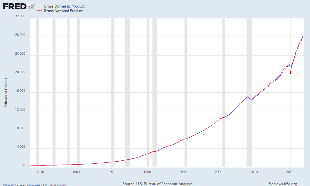
FRED Graph

GDP in Q4 2012 stood at $15,851.2 billion. GNP at Q3 2012 (the last data point available) stood at $16,054.2 billion. For our present purposes, one substitutes equally as well for the other.

For the market value of all publicly traded securities, we can use The Wilshire 5000 Total Market Index. The index stood Friday at $16,461.52 billion. The following chart updates in real time:

Chart

Here are the calculations:

  • The current ratio of total market capitalization to GNP is 16,461.52 / 16,054.2 or 103 percent.
  • The current ratio of total market capitalization to GDP is 16,461.52 / 15,851.2 or 104 percent.

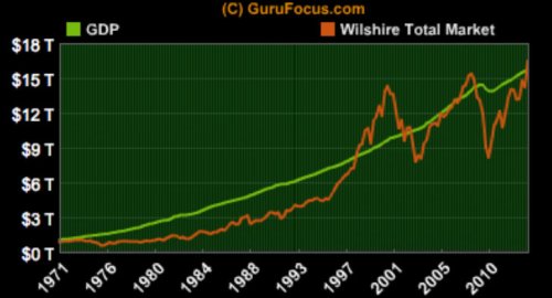
You can undertake these calculations yourself, or you can go to Gurufocus, which has a series of handy charts demonstrating the relationship of GDP to Wilshire total market capitalization:

Chart 1. Total Market Cap and GDP

GDP WIlshire Total Market

Chart 1 demonstrates that total market capitalization has now exceeded GDP (note the other two auspicious peaks of total market capitalization over GDP in 1999 and 2007).

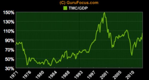
Chart 2. Ratio of Total Market Capitalization and GDP

Total Market Cap GDP Ratio

Chart 2 shows that the current ratio is well below the ratio achieved in the last two peaks (1999 and 2007), but well above the 1982 stock market low preceding the last secular bull market.

But, so what? Is the ratio of total market capitalization to GDP predictive?

In this week’s The Hook (March 25, 2013) Hussman discusses his use of market value of U.S. equities relative to GDP, which he says has a 90% correlation with subsequent 10-year total returns on the S&P 500:

Notably, the market value of U.S. equities relative to GDP – though not as elevated as at the 2000 bubble top – is not depressed by any means. On the contrary, since the 1940’s, the ratio of equity market value to GDP has demonstrated a 90% correlation with subsequent 10-year total returns on the S&P 500 (see Investment, Speculation, Valuation, and Tinker Bell), and the present level is associated with projected annual total returns on the S&P 500 of just over 3% annually.

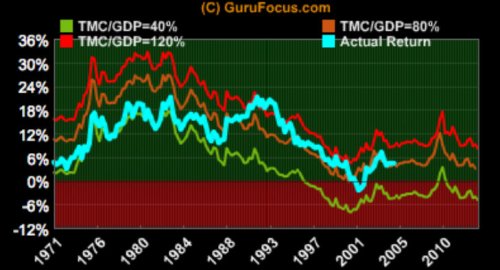
Here’s Gurufocus’s comparison of predicted and actual returns assuming three different ratios (TMC/GDP = 40 percent, 80 percent, and 120 percent) at the terminal date:

Chart 3. Predicted and Actual Returns

Predicted and Actual Returns GDP Total Market Cap

Chart 3 shows the outcome of three terminal ratios of total market capitalization to GDP. Consider the likelihood of these three scenarios:

  1. A terminal ratio of 120 percent (equivalent to the 1999 to 2001 peak) leads to annualized nominal returns of 8.1 percent over the next 10 years.
  2. A terminal ratio of 80 percent (the long-run average) leads to annualized nominal returns of 3 percent over the next 10 years.
  3. A terminal ratio of 40 percent (approximating the 1982 low of 35 percent) leads to annualized nominal returns of -5 percent over the next 10 years.

For mine, 1 seems less likely than scenarios 2 or 3, with the long run mean (scenario 2) the most likely. For his part, Buffett opines:

For me, the message of that chart is this: If the percentage relationship falls to the 70% or 80% area, buying stocks is likely to work very well for you. If the ratio approaches 200%–as it did in 1999 and a part of 2000–you are playing with fire.

Gurufocus’s 80-percent-long-run-average calculation agrees with Hussman’s calculation of average annualized market return of 3%:

As of today, the Total Market Index is at $ 16461.5 billion, which is about 104.3% of the last reported GDP. The US stock market is positioned for an average annualized return of 3%, estimated from the historical valuations of the stock market. This includes the returns from the dividends, currently yielding at 2%.

Here’s Buffett again:

The tour we’ve taken through the last century proves that market irrationality of an extreme kind periodically erupts–and compellingly suggests that investors wanting to do well had better learn how to deal with the next outbreak. What’s needed is an antidote, and in my opinion that’s quantification. If you quantify, you won’t necessarily rise to brilliance, but neither will you sink into craziness.

On a macro basis, quantification doesn’t have to be complicated at all. Below is a chart, starting almost 80 years ago and really quite fundamental in what it says. The chart shows the market value of all publicly traded securities as a percentage of the country’s business–that is, as a percentage of GNP. The ratio has certain limitations in telling you what you need to know. Still, it is probably the best single measure of where valuations stand at any given moment. And as you can see, nearly two years ago the ratio rose to an unprecedented level. That should have been a very strong warning signal.

The current ratios of total market capitalization to GNP and GDP should be very strong warning signals. Further, that they imply similar returns to the Shiller PE and Tobin’s q, suggests that they are robust.

Order Quantitative Value from Wiley FinanceAmazon, or Barnes and Noble.

Click here if you’d like to read more on Quantitative Value, or connect with me on LinkedIn.
Read Full Post »

Further to my point that if your valuation models use forward estimates rather than twelve-month trailing data, you’re doing it wrong, here are the results of our Quantitative Value backtest on the use of consensus Institutional Brokers’ Estimate System (I/B/E/S) earnings forecasts of EPS for the fiscal year (available 1982 through 2010) for individual stock selection:

We analyze the compound annual growth rates of each price ratio over the 1964 to 2011 period for market capitalization–weighted decile portfolios.

The forward earnings estimate is the worst performed metric by a wide margin. The performance of the forward earnings estimate is uniformly poor, earning a compound annual growth rate of just 8.63 percent on average and underperforming the Standard & Poor’s (S&P) 500 by almost 1 percent per year. Investors are wise to shy away from analyst forward earnings estimates when making investment decisions.

We focus our analysis on historical valuation metrics in Quantitative Value and leave the forward earnings estimates to the promoters on Wall Street.

Read Full Post »

If your valuation models use forward estimates rather than twelve-month trailing data, you’re doing it wrong. Why? As we discussed in Quantitative Value, analysts are consistently too optimistic about the future, and so systematically overestimate forward earnings figures.

They are consistently, systematically, predictably ignorant of mean-reverting base rates. As we wrote in the book:

Exceptions to the long pattern of excessively optimistic forecasts are rare. Only in 1995 and 2004 to 2006, when strong economic growth generated earnings that caught up with earlier predictions, do forecasts actually hit the mark. When economic growth accelerates, the size of the forecast error declines; when economic growth slows, it increases.

This chart from JP Morgan Asset Management as of a week ago shows the chronic overestimation of operating earnings:

The chart comes via Zero Hedge, where they ask, “Is the market cheap?” My answer is not on the basis of the Shiller PE, which stands at 23.7 versus the long run arithmetic mean of 16.47 or around 40 percent overvalued. Neither is it cheap on the basis of Tobin’s q. Smither’s & Co. has it at 44 percent overvalued on the basis of q, and they note:

As at 12th March, 2013 with the S&P 500 at 1552 the overvaluation by the relevant measures was 57% for non-financials and 65% for quoted shares.

Although the overvaluation of the stock market is well short of the extremes reached at the year ends of 1929 and 1999, it has reached the other previous peaks of 1906, 1936 and 1968.

How about the single year P/E ratio as reported? The S&P 500 TTM P/E stands at 18 versus the long run mean of 15.49. But it’s cool because the “E” is growing, right? Err, no. The “E” peaked in February last year (see Standard & Poor’s current S&P 500 Earnings, go to “Download Index Data,” and select “Index Earnings”). The multiple will now have to expand just to keep the market where it is. You have to do these sort of acrobatics to get it going up:

Margins are now going to bounce free of the wreckage like those few lucky souls who remember to assume the brace position before the plane hits the ground, even though the as reported rolled over a year ago (I hope Denzel Washington is flying this plane).

So how is it cheap?

It’s at 14.5 on the basis of twelve-month forward operating earnings estimates versus a long run mean of 15.49. You gotta do what you gotta do to get the Muppets to buy.

Good luck with that.

Read Full Post »

In the How to beat The Little Book That Beats The Market (Part 1 2, and 3) series of posts I showed how in Quantitative Value we tested Joel Greenblatt’s Magic Formula (outlined in The Little Book That (Still) Beats the Market) and found that it had consistently outperformed the market, and with lower relative risk than the market.

We sought to improve on it by creating a generic, academic alternative that we called “Quality and Price.” Quality and Price is the academic alternative to the Magic Formula because it draws its inspiration from academic research papers. We found the idea for the quality metric in an academic paper by Robert Novy-Marx called The Other Side of Value: Good Growth and the Gross Profitability Premium. Quality and Price substitutes for the Magic Formula’s ROIC a quality measure called gross profitability to total assets (GPA), defined as follows:

GPA = (Revenue − Cost of Goods Sold) / Total Assets

In Quality and Price, the higher a stock’s GPA, the higher the quality of the stock.

The price ratio, drawn from the early research into value investment by Eugene Fama and Ken French, is book value-to-market capitalization (BM), defined as follows:

BM = Book Value / Market Price

The Quality and Price strategy, like the Magic Formula, seeks to differentiate between stocks by equally weighting the quality and price metrics. Can we improve performance by seeking higher quality stocks in the value decile, rather than equal weighting the two factors?

In his paper The Quality Dimension of Value Investing, Novy-Marx considered this question. Novy-Marx’s rationale:

Value investors can also improve their performance by controlling for quality when investing in value stocks. Traditional value strategies formed on price signals alone tend to be short quality, because cheap firms are on average of lower quality than similar firms trading at higher prices. Because high quality firms on average outperform low quality firms, this quality deficit drags down the returns to traditional value strategies. The performance of value strategies can thus be significantly improved by explicitly controlling for quality when selecting stocks on the basis of price. Value strategies that buy (sell) cheap (expensive) firms from groups matched on the quality dimension significantly outperform value strategies formed solely on the basis of valuations.

His backtest method:

The value strategy that controls for quality is formed by first sorting the 500 largest financial firms each June into 10 groups of 50 on the basis of the quality signal. Within each of these deciles, which contain stocks of similar quality, the 15 with the highest value signals are assigned to the high portfolio, while the 15 with the lowest value signals are assigned to the low portfolio. This procedure ensures that the value and growth portfolios, which each hold 150 stocks, contain stocks of similar average quality.

Novy-Marx finds that the strategy “dramatically outperform[s]” portfolios formed on the basis of quality or value alone, but underperforms the Greenblatt-style joint strategy. From the paper:

The long/short strategy generated excess returns of 45 basis points per month, 50% higher than the 31 basis points per month generated by the unconditional quality strategy, despite running at lower volatility (10.4% as opposed to 12.2%). The long side outperformed the market by 32 basis points per month, 9 basis points per month more than the long-only strategy formed without regard for price. It managed this active return with a market tracking error volatility of only 5.9%, realizing an information ratio of 0.63, much higher than the information ratio of 0.42 realized on the tracking error of the unconditional long-only value strategy.

For comparison, Novy-Marx finds the Greenblatt-style joint 50/50 weighting generates higher returns:

The long/short strategy based on the joint quality and value signal generated excess returns of 61 basis points per month, twice that generated by the quality or value signals alone and a third higher than the market, despite running at a volatility of only 9.7%. The strategy realized a Sharpe ratio 0.75 over the sample, almost two and a half times that on the market over the same period, despite trading exclusively in the largest, most liquid stocks.

The long side outperformed the market by 35 basis points per month, with a tracking error volatility of only 5.7 percent, for a realized information ratio of 0.75. This information ratio is 15% higher than the 0.65 achieved running quality and value side by side. Just as importantly, it allows long-only investors to achieve a greater exposure to the high information ratio opportunities provided by quality and value. While the strategy’s 5.7% tracking error still provides a suboptimally small exposure to value and quality, this exposure is significantly larger than the long-only investor can obtain running quality alongside value.

And a pretty chart from the paper:

Novy-Marx 2.1

We tested the decile approach and the joint approach in Quantitative Value, substituting better performing value metrics and found different results. I’ll cover those next.

Read Full Post »

There are good reasons for tracking activists. For one, research supports the view that stocks the subject of activist campaigns can generate significant above market returns, on the filing and, importantly, in the subsequent year. Recent industry research by Ken Squire, manager of the 13D Activist mutual fund (DDDAX), finds an average outperformance of 16% over the subsequent 15 months for companies larger than $1 billion in market cap:

Ken Squire is founder and principal of 13D Monitor, a research service that tracks activist investing and has data on Icahn-led activist situations since 1994, when the investor targeted Samsonite Corp. The average return of the 85 positions since then was 18.7% (measured until he closed the position, if at all), compared to 12.7% for the Standard & Poor’s 500 over comparable time frames.

Yet this impressive-seeming average outperformance should be viewed in the context of a general tendency of stocks to outperform once they have attracted the intense interest of known activist investors. In other words, this doesn’t apply to Icahn alone.

Squire calculates that, following a 13D filing, the shares of companies larger than $1 billion in market value have historically outperformed the S&P 500 by an average of 16 percentage points over the subsequent 15 months. A separate study of nearly 300 activist actions by hedge funds between April 2006 and September 2012 found a similarly strong record of success. Squire runs the relatively new (and so-far small) 13D Activist mutual fund (DDDAX), which chooses stocks from among ongoing activist situations and beat the S&P 500 by 5.27% in 2012, after fees.

Squire takes into account the past record of specific activist investors when considering fund holdings. Hedge fund JANA Partners, for example, has a strong success rate in its arm-twisting maneuvers on corporate executives it deems lacking. One of its prominent targets currently is Canadian fertilizer giant Agrium Inc. (AGU).

Squire’s research accords with earlier studies on this site, most notably these two:

  1. In Entrepreneurial Shareholder Activism: Hedge Funds and Other Private Investors, April Klein and Emanuel Zur examined recent “confrontational activism campaigns” by “entrepreneurial shareholder activists” and concluded that such strategies generate “significantly positive market reaction for the target firm around the initial Schedule 13D filing date” and “significantly positive returns over the subsequent year.” The authors find that the filing of a 13D notice by an activist hedge fund is a catalytic event for a firm that heralds substantial positive returns in the stock. Klien and Zur found that “hedge fund targets earn 10.2% average abnormal stock returns during the period surrounding the initial Schedule 13D. Other activist targets experience a significantly positive average abnormal return of 5.1% around the SEC filing window. These findings suggest that, on average, the market believes activism creates shareholder value. … Furthermore, our target abnormal returns do not dissipate in the 1-year period following the initial Schedule 13D. Instead, hedge fund targets earn an additional 11.4% abnormal return during the subsequent year, and other activist targets realize a 17.8% abnormal return over the year following the activists’ interventions.”
  2. In Hedge Fund Activism, Corporate Governance, and Firm Performance, authors Brav, Jiang, Thomas and Partnoy found that the “market reacts favorably to hedge fund activism, as the abnormal return upon announcement of potential activism is in the range of [7%] seven percent, with no return reversal during the subsequent year.” Further, the paper “provides important new evidence on the mechanisms and effects of informed shareholder monitoring.”

h/t @reformedbroker

Read Full Post »

In How to Beat The Little Book That Beats The Market: Redux (and Part 2) I showed how in Quantitative Value we tested Joel Greenblatt’s Magic Formula outlined in The Little Book That (Still) Beats the Market).

We created a generic, academic alternative to the Magic Formula that we call “Quality and Price,” that substituted for EBIT/TEV as its price measure the classic measure in finance literature – book value-to-market capitalization (BM):

BM = Book Value / Market Price

Quality and Price substitutes for ROIC a quality measure called gross profitability to total assets (GPA). GPA is defined as follows:

GPA = (Revenue − Cost of Goods Sold) / Total Assets

Like the Magic Formula, it seeks to identify the best combination of high quality and low price. The difference is that Quality and Price substitutes different measures for the quality and price factors. There are reasonable arguments for adopting the measures used in Quality and Price over those used in the Magic Formula, but it’s not an unambiguously more logical approach than the Magic Formula. Whether one combination of measures is better than any other ultimately depends here on their relative performance. So how does Quality and Price stack up against the Magic Formula?

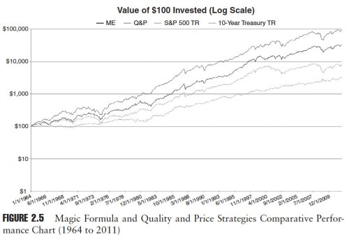
Here are the results of our study comparing the Magic Formula and Quality and Price strategies for the period from 1964 to 2011. Figure 2.5 from the book shows the cumulative performance of the Magic Formula and the Quality and Price strategies for the period 1964 to 2011.

Magic Formula vs Quality and Price

Quality and Price handily outpaces the Magic Formula, turning $100 invested on January 1, 1964, into $93,135 by December 31, 2011, which represents an average yearly compound rate of return of 15.31 percent. The Magic Formula turned $100 invested on January 1, 1964, into $32,313 by December 31, 2011, which represents a CAGR of 12.79 percent. As we discuss in detail in the book, while much improved, Quality and Price is not a perfect strategy: the better returns are attended by higher volatility and worse drawdowns. Even so, on risk-adjusted basis, Quality and Price is the winner.

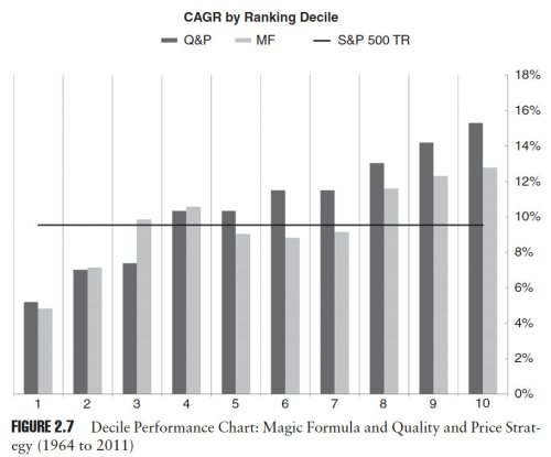
Figure 2.7 shows the performance of each decile ranked according to the Magic Formula and Quality and Price for the period 1964 to 2011. Both strategies do a respectable job separating the better performed stocks from the poor performers.

Qp MF Decile

This brief examination of the Magic Formula and its generic academic brother Quality and Price, shows that analyzing stocks along price and quality contours can produce market-beating results. This is not to say that our Quality and Price strategy is the best strategy. Far from it. Even in Quality and Price, the techniques used to identify price and quality are crude. More sophisticated measures exist.

At heart, we are value investors, and there are a multitude of metrics used by value investors to find low prices and high quality. We want to know whether there are other, more predictive price and quality metrics than those used by Magic Formula and Quality and Price.

In Quantitative Value, we conduct an examination into existing industry and academic research into a variety of fundamental value investing methods, and simple quantitative value investment strategies. We then independently backtest each method, and strategy, and combine the best into a new quantitative value investment model.

Order from Quantitative Value from Wiley FinanceAmazon, or Barnes and Noble.

Click here if you’d like to read more on Quantitative Value, or connect with me on LinkedIn.
Read Full Post »

Wes sent through this outstanding more-than-30-year-old speech, Trying Too Hard (.pdf), which foreshadows many of the ideas we discuss in Quantitative Value, so much so that I feel that I should point out that neither Wes nor I had read it before we wrote the book. The speaker, Dean Williams, named the speech for this story:

I had just completed what I thought was some fancy footwork involving buying and selling a long list of stocks. The oldest member of Morgan’s trust committee looked down the list and said, “Do you think you might be trying too hard?” A the time I thought, “Who ever heard of trying too hard?” Well, over the years I’ve changed my mind about that. Tonight I’m going to ask you to entertain some ideas shoe theme is this: We probably are trying too hard at what we do. More than that, no matter how hard we try, we may not be as important to the results as we’d like to think we are.

The speech covers the following themes, among others:

  • Prediction

…[M]ost of us spend a lot of out time doing something that human beings just don’t do very well. Predicting things.

  • Forecasting, information, and accuracy

Confidence in a forecast rises with the amount of information that goes into it. But the accuracy of the forecast stays the same. 

  • Expertise and forecasting

And when it comes to forecasting – as opposed to doing something – a lot of expertise is no better than a little expertise. And may be even worse.

  • The importance of mean reversion

If there is a reliable and helpful principle at works in our markets, my choice would be the ones the statisticians call “regression to the mean”. The tendency toward average profitability is a fundamental, if not the fundamental principle of competitive markets.

It can be a powerful investment tool. It can, almost by itself, select cheap portfolios and avoid expensive ones.

  • Simplicity

Simple approaches. Albert Einstein said that “… most of the fundamental ideas of science are essentially simple and may, as a rule, be expressed in a language comprehensible to everyone“.

  • Consistency

Look at the best performing funds for the past ten years or more. Templeton, Twentieth Century Growth, Oppenheimer Special, and others. What did they have in common?

It was that whatever their investment plans were, they had the discipline and good sense to carry them out consistently.

  • And finally, value

Spend your time measuring value instead of generating information. Don’t forecast. Buy what’s cheap today.

Read Trying Too Hard (.pdf). You won’t regret it.

h/t/ The Turnkey Analyst

Read Full Post »

In How to Beat The Little Book That Beats The Market: Redux I showed how in Quantitative Value we tested Joel Greenblatt’s Magic Formula outlined in The Little Book That (Still) Beats the Market). We found that Greenblatt’s Magic Formula has consistently outperformed the market, and with lower relative risk than the market, but wondered if we could improve on it.

We created a generic, academic alternative to the Magic Formula that we call “Quality and Price.” Quality and Price is the academic alternative to the Magic Formula because it draws its inspiration from academic research papers. We found the idea for the quality metric in an academic paper by Robert Novy-Marx called The Other Side of Value: Good Growth and the Gross Profitability Premium. The price ratio is drawn from the early research into value investment by Eugene Fama and Ken French. The Quality and Price strategy, like the Magic Formula, seeks to differentiate between stocks on the basis of … wait for it … quality and price. The difference, however, is that Quality and Price uses academically based measures for price and quality that seek to improve on the Magic Formula’s factors, which might provide better performance.

The Magic Formula uses Greenblatt’s version of return on invested capital (ROIC) as a proxy for a stock’s quality. The higher the ROIC, the higher the stock’s quality and the higher the ranking received by the stock. Quality and Price substitutes for ROIC a quality measure we’ll call gross profitability to total assets (GPA). GPA is defined as follows:

GPA = (Revenue − Cost of Goods Sold) / Total Assets

In Quality and Price, the higher a stock’s GPA, the higher the quality of the stock. The rationale for using gross profitability, rather than any other measure of profitability like earnings or EBIT, is simple. Gross profitability is the “cleanest” measure of true economic profitability. According to Novy-Marx:

The farther down the income statement one goes, the more polluted profi tability measures become, and the less related they are to true economic profi tability. For example, a firm that has both lower production costs and higher sales than its competitors is unambiguously more profitable. Even so, it can easily have lower earnings than its competitors. If the firm is quickly increasing its sales though aggressive advertising, or commissions to its sales force, these actions can, even if optimal, reduce its bottom line income below that of its less profitable competitors. Similarly, if the firm spends on research and development to further increase its production advantage, or invests in organizational capital that will help it maintain its competitive advantage, these actions result in lower current earnings. Moreover, capital expenditures that directly increase the scale of the firm’s operations further reduce its free cash flows relative to its competitors. These facts suggest constructing the empirical proxy for productivity using gross profits.

The Magic Formula uses EBIT/TEV as its price measure to rank stocks. For Quality and Price, we substitute the classic measure in finance literature – book value-to-market capitalization (BM):

BM = Book Value / Market Price

 We use BM rather than the more familiar price-to-book value or (P/B) notation because the academic convention is to describe it as BM, and it makes it more directly comparable with the Magic Formula’s EBIT/TEV. The rationale for BM capitalization is straightforward. Eugene Fama and Ken French consider BM capitalization a superior metric because it varies less from period to period than other measures based on income:

We always emphasize that different price ratios are just different ways to scale a stock’s price with a fundamental, to extract the information in the cross-section of stock prices about expected returns. One fundamental (book value, earnings, or cashflow) is pretty much as good as another for this job, and the average return spreads produced by different ratios are similar to and, in statistical terms, indistinguishable from one another. We like [book-to-market capitalization] because the book value in the numerator is more stable over time than earnings or cashflow, which is important for keeping turnover down in a value portfolio.

Next I’ll compare show the results of our examination of Quality and Price strategy to the Magic Formula. If you can’t wait, you can always pick up a copy of Quantitative Value.

Read Full Post »

This letter from Howard Buffett, the highly libertarian “Old Right” United States Representative father of Warren, to anarcho-capitalist historian and economist Murray Rothbard, if real, is incredible. Buffett the Elder wrote to Rothbard that he “read that Rothbard had written a book on ‘The Panic of 1819‘” and wanted to know where he could buy a copy for his son “who is a particularly avid reader of books about panics and similar phenomena.”

Here is the letter:

Howard-Buffett-715x1024

The timing of the letter – July 31, 1962 – is interesting. The first “flash crash” occurred in May 1962, and was at the time the worst crash since 1929. Time LIFE described the 1962 “flash crash” thus:

The signs, like the rumblings of an Alpine ice pack at the time of thaw, had been heard. The glacial heights of the stock boom suddenly began to melt in a thaw of sell-off. More and more stocks went up for sale, with fewer and fewer takers at the asking price. Then suddenly, around lunchtime on Monday, May 28, the sell-off swelled to an avalanche. In one frenzied day in brokerage houses and stock exchanges across the U.S., stock values — glamor and blue-chip alike — took their sharpest drop since 1929.

Memory of the great crash, and the depression that followed, has haunted America’s subconscious. Now, after all these years, was that nightmare to happen again?

The article continues that, “although the Dow Jones Industrial Average fell almost 6 percent on that one vertiginous Monday and the market was anemic for a year afterwards, the markets as a whole, at home and abroad, did bounce back.” Good to know.

h/t: Mises.org

Read Full Post »

Robert Novy-Marx, whose The Other Side of Value paper we quoted from extensively in Quantitative Value, has produced another ripping paper called The Quality Dimension of Value Investing (.pdf). Novy-Marx argues that  value investment strategies that seek high quality stocks are “nearly as profitable as traditional value strategies based on price signals alone.”

Accounting for both dimensions by trading on combined quality and price signals yields dramatic performance improvements over traditional value strategies. Accounting for quality also yields significant performance improvements for investors trading momentum as well as value.

Novy-Marx’s The Other Side of Value paper showed that a simple quality metric, gross profits-to-assets, has roughly as much power predicting the relative performance of different stocks as tried-and-true value measures like book-to-price.

Buying profitable firms and selling unprofitable firms, where profitability is measured by the difference between a firm’s total revenues and the costs of the goods or services it sells, yields a significant gross profitability premium.

Most intriguingly, Novy-Marx finds that “the signal in gross profits-to-assets is negatively correlated with that in valuation ratios.”

High quality firms tend to trade at premium prices, so value strategies that trade on quality signals (i.e., quality strategies) hold very different stocks than value strategies that trade on price signals. Quality strategies tilt towards what would traditionally be considered growth stocks. This makes quality strategies particularly attractive to traditional value investors, because quality strategies, in addition to delivering significant returns, provide a hedge to value exposures.

Novy-Marx argues that investors can “directly combine the quality and value signals and, in line with Graham’s basic vision, only buy high quality stocks at bargain prices. By trading on a single joint profitability and value signal, an investor can effectively capture the entirety of both premiums.

Performance of Quality, Value and Joint Strategies

(Click to enlarge).

Novy-Marx 2.1

Figure 1 shows the performance of a dollar invested in mid-1963 in T-bills, the market, and strategies that trade on the quality signal, the value signal, and the joint quality and value signal. The top panel shows long/short strategies, which are levered each month to run at market volatility (i.e., an expected ex ante volatility of 16%, with leverage based on the observed volatility of the unlevered strategy over the preceding 60 months). By the end of 2011 a dollar invested in T-bills in 1963 would have grown to $12.31. A dollar invested in the market would have grown to $84.77. A dollar invested in the quality and value strategies would have grown to $94.04 and $35.12, respectively. A dollar invested in the strategy that traded on the joint quality and value signal would have grown to more than $2,131.

The bottom panel shows the performance of the long-only strategies. While a dollar invested in the market would have grown to more than $80, a dollar invested in profitable large cap stocks would have grown to $241, a dollar invested in cheap large cap stocks would have grown to $332, and a dollar invested in cheap, profitable large cap stocks would have grown to $572.

Drawdowns to Quality, Value, and Joint strategies

(Click to enlarge).

Novy Marx 2.2

Figure 2 shows the drawdowns of the long/short strategies (top panel) and the worst cumulative under performance of the long-only strategies relative to the market, i.e., the drawdowns on the long-only strategies’ active returns (bottom panel). The top panel shows that the worst drawdowns experienced over the period by the long/short strategies run at market volatility were similar to market’s worst drawdown over the period. The joint quality and value strategy had, however, the smallest drawdowns of all the strategies considered. Its worst drawdown (48.7% in 2000) compares favorably to the worst drawdowns experienced by the market (51.6% in 2008-9, not shown), the traditional value strategy (down 59.5% by 2000), and the pure quality strategy (51.4% to 1977). Similar results hold for the worst five or ten drawdowns (average losses of 35.5% versus 41.1%, 38.9%, and 35.6% for the worst five drawdowns, and average losses of 25.8% versus 28.5%, 28.7%, and 26.5% for the worst ten drawdowns).

The bottom panel shows even more dramatic results for the long-only strategies active returns. Value stocks underperformed the market by 44% through the tech run-up over the second half of the ‘90s. Quality stocks lagged behind the market through much of the ‘70s, falling 28.1% behind by the end of the decade. Cheap, profitable stocks never lagged the market by more than 15.8%. Periods over which these stocks underperformed also tended to be followed quickly by periods of strong outperformance, yielding transient drawdowns that were sharply reversed.

Importantly, the signal in gross profitability is “extremely persistent,” and works well in the large cap universe.

Profitability strategies thus have low turnover, and can be implemented using liquid stocks with large capacities.

Novy-Marx’s basic message is that investors, in general but especially traditional value investors, leave money on the table when they ignore the quality dimension of value.

Read The Quality Dimension of Value Investing (.pdf).

Tomorrow, I show in an extract from Quantitative Value how we independently tested gross-profits-on-total-assets and found it to be highly predictive.

Read Full Post »

« Newer Posts - Older Posts »