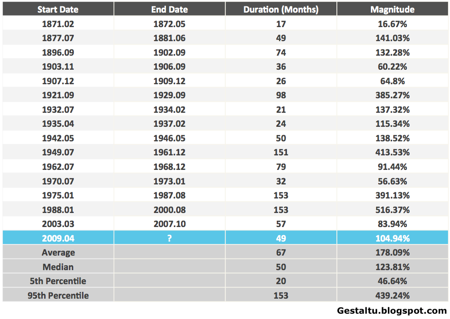
I’ve posted here regularly about the implications of mean reversion in elevated profit margins (see, for example, The Temptation To Abandon Proven Models In Speculative and Fearful Markets: Why This Time Isn’t Different, What Record Corporate Profit Margins Imply For Future Profitability and The Stock Market, Warren Buffett, Jeremy Grantham, and John Hussman on Profit, GDP and Competition). Those posts sparked some intense debate in the comments and offline about the increasing influence of foreign profits on corporate profit margins, and how this change may have permanently shifted up the mean for corporate profits as a proportion of GDP. The impact of such a structural change in the mean is twofold: First, it implies that the current cyclical extreme in the level of corporate profits as a proportion of GDP is less extreme than it appears on its face; and, second, that the ratio of corporate profits-to-GDP is less predictive as an indicator than it has been historically.
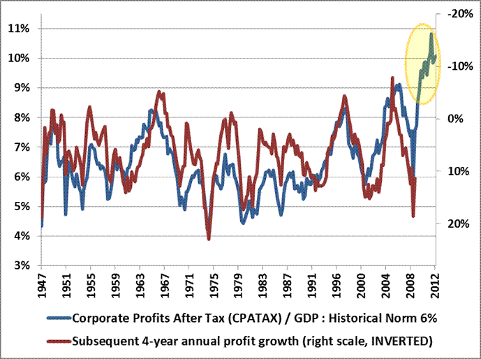
This is the chart, and the following comment, that sparked the debate:

Source: Hussman Weekly Comment “Taking Distortion at Face Value,” (April 8, 2013)
Hussman commented in relation to the chart (in Two Myths and a Legend, March 11, 2013):
In general, elevated profit margins are associated with weak profit growth over the following 4-year period. The historical norm for corporate profits is about 6% of GDP. The present level is about 70% above that, and can be expected to be followed by a contraction in corporate profits over the coming 4-year period, at a roughly 12% annual rate. This will be a surprise. It should not be a surprise.
Raj Yerasi, a money manager based in New York, has taken on the unenviable task in the following guest post of arguing the case that the increasing influence of foreign earnings on corporate profit margins means that the ratio in the chart overstates future mean reversion in earnings:
Profiting From Profits
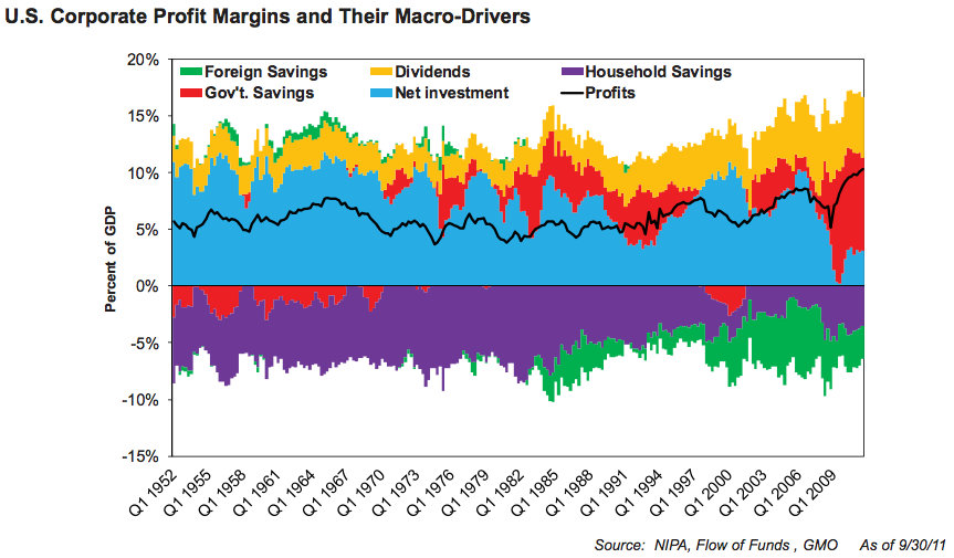
Today more than ever the question of whether the stock market is overvalued or reasonably valued depends on whether corporate profit margins are abnormally elevated or sustainable. Some astute investors (such as Hussman and GMO) have argued in essence that the combination of record government deficit spending and unemployment levels has propped up corporate revenues while lowering labor costs, thereby boosting corporate profit margins by as much as 70 percent above historical averages. They contend that the withdrawal of fiscal stimulus as well as competitive dynamics will sooner or later cause profit margins to revert to the mean, unmasking substantial equity overvaluation.
This analysis purports to show that profits are indeed elevated above historical levels, but not nearly as much as some investors think, due to issues in the BEA’s NIPA data series they are using. Furthermore, the impact of any mean reversion in profit margins on overall equity market profits may be lower than people think.
To understand this, it is important to note that current analyses do not directly measure profit margins per se (meaning, profits divided by revenues). Rather, they measure corporate profits as a percentage of GDP, which captures not total revenues but the total value addition of corporations (along with other components). While there are multiple potential data issues in comparing profits to GDP, it nonetheless stands to reason that profits as a percentage of GDP should generally correlate with profit margins.
However, one big source of error is that the most widely known NIPA corporate profits data series, which the analyses referenced above appear to be using, represents profits generated by corporations that are considered US residents. As such, this data series includes profits generated by US companies’ international operations (e.g. Coca-Cola India, Coca-Cola China) and excludes profits generated by foreign companies’ US operations (e.g. Toyota USA). GDP, meanwhile, captures all economic activity within US borders, whether undertaken by US companies or foreign companies, and it excludes any economic activity abroad. It should be clear that one cannot compare these two metrics, since the corporate profits data series introduces profits generated by other economies and excludes profits generated by the US economy.
Since we are interested in how profit levels have changed over time, this mismatch might not matter, except that US companies’ profits from abroad have grown tremendously over the last 10 years, much more so than foreign companies’ profits from US operations:
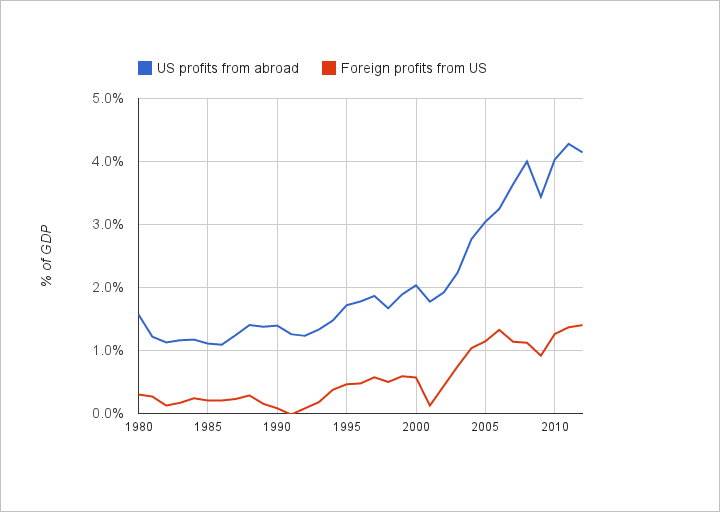
This skews the calculated profits level upwards and by an increasing amount over time, making profit levels today look exceedingly elevated.
To do the analysis correctly, we need to use data that are more apples-to-apples. Fortunately, the NIPAs do include a data series of corporate profits that simultaneously excludes US companies’ profits from abroad and includes foreign companies´ profits from US operations, called “domestic industries” profits. Comparing these profits to GDP, profit levels still appear elevated but now not as much as when using the prior “national” profits data series:
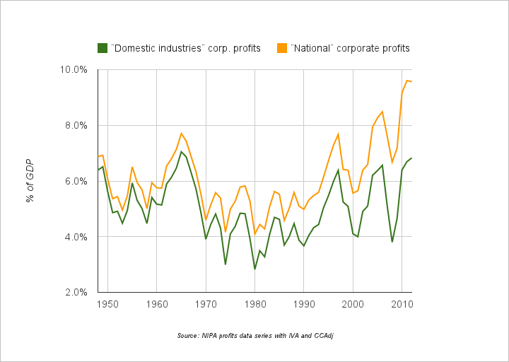
Profits now appear to be at levels matching previous highs rather than at levels far exceeding previous highs. Comparing these levels to the average level since 1948, current profit levels are 40 percent above the average, with this average including an extended contractionary period in the 70s and 80s.
It is worth noting that these percentages match very closely with those cited by Warren Buffett in his 1999 article “Mr. Buffett On The Stock Market“. If we use the 4.0 percent to 6.5 percent range that Mr. Buffett observed as a “normalcy” band, then profit levels today are about 30 percent above the midpoint of that band. That is high, no doubt, but not as terrifying as 70 percent above the average.
It is also worth noting that effective corporate tax rates are lower today than in the past. Per the NIPA data, tax rates have decreased from about 45 percent in the 80s to 40 percent in the 90s to 30 percent in recent years. Using pre-tax “domestic industries” profits as a percentage of GDP, profit levels today may be closer to 20 percent elevated relative to historical norms. One may wish to focus solely on after-tax profit levels, since in theory companies target minimum after-tax returns on capital, but on the other hand, a consumer deciding whether it’s worth paying a premium for a company’s product or service may not be affected by that company’s tax burden. The right approach could be somewhere in between.
So what are the implications of all this? The actual extent and pace of mean reversion in profit margins will depend on other factors besides fiscal consolidation and unemployment: trade deficits, credit creation, tax policy, antitrust enforcement, etc. Setting all that aside, if we assume that profit margins of domestic businesses are, say, 30 percent higher than where they should be and will be, then we also need to figure out what percentage of equity market index earnings come from domestic operations. If we assume that, say, 1/3 of index earnings are from international operations that will not be affected by mean reversion in US profits, then the total drop in index earnings might only be 15 percent (since mean reversion from a 30 percent higher level implies a 23 percent drop, but only on 2/3 of earnings).
This is not to say, of course, that the consequences of mean reversion would be evenly distributed by sector. Perhaps investors are better off taking into account mean reversion on a sector by sector basis, given that we do not seem to be looking at a scenario of plummeting earnings that will sink all boats.
Special thanks to Andrew Hodge of BEA for clarifying certain NIPA data. Any remaining misunderstandings are the author´s responsibility.
—
Many thanks to Raj for a well-written argument.
Hussman anticipated Raj’s argument earlier. See The Temptation To Abandon Proven Models In Speculative and Fearful Markets: Why This Time Isn’t Different for Hussman’s rejoinder.
Order Quantitative Value from Wiley Finance, Amazon, or Barnes and Noble.
Click here if you’d like to read more on Quantitative Value, or connect with me on LinkedIn.
Read Full Post »
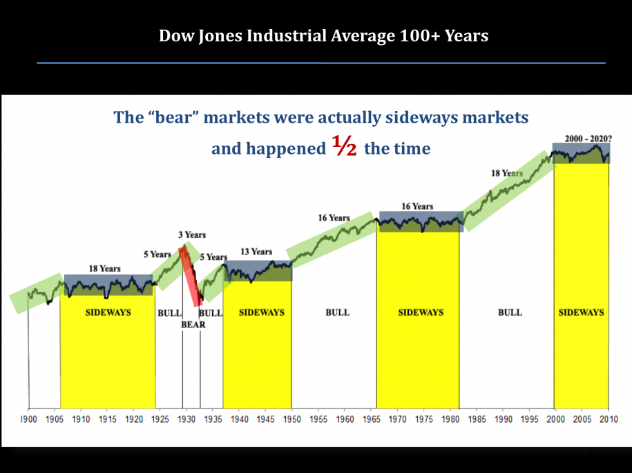
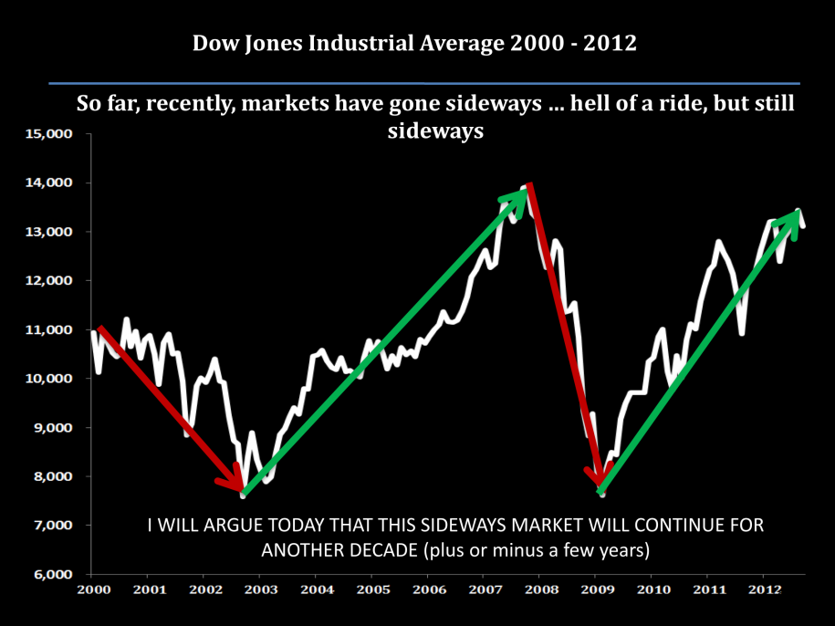
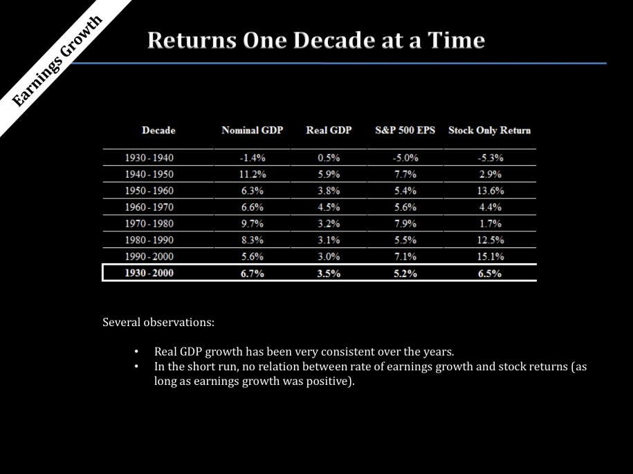
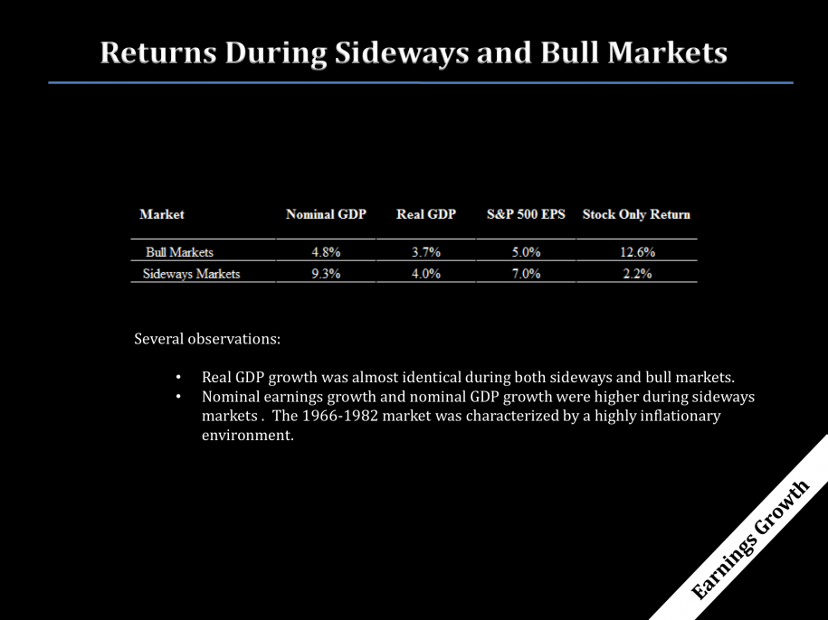
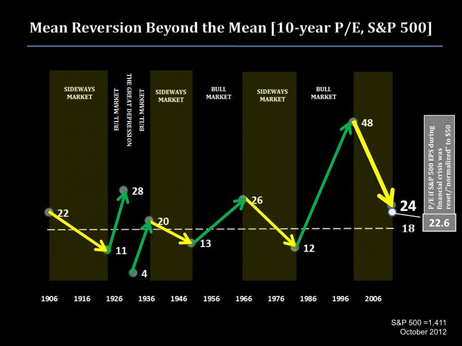

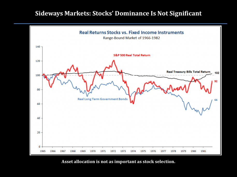
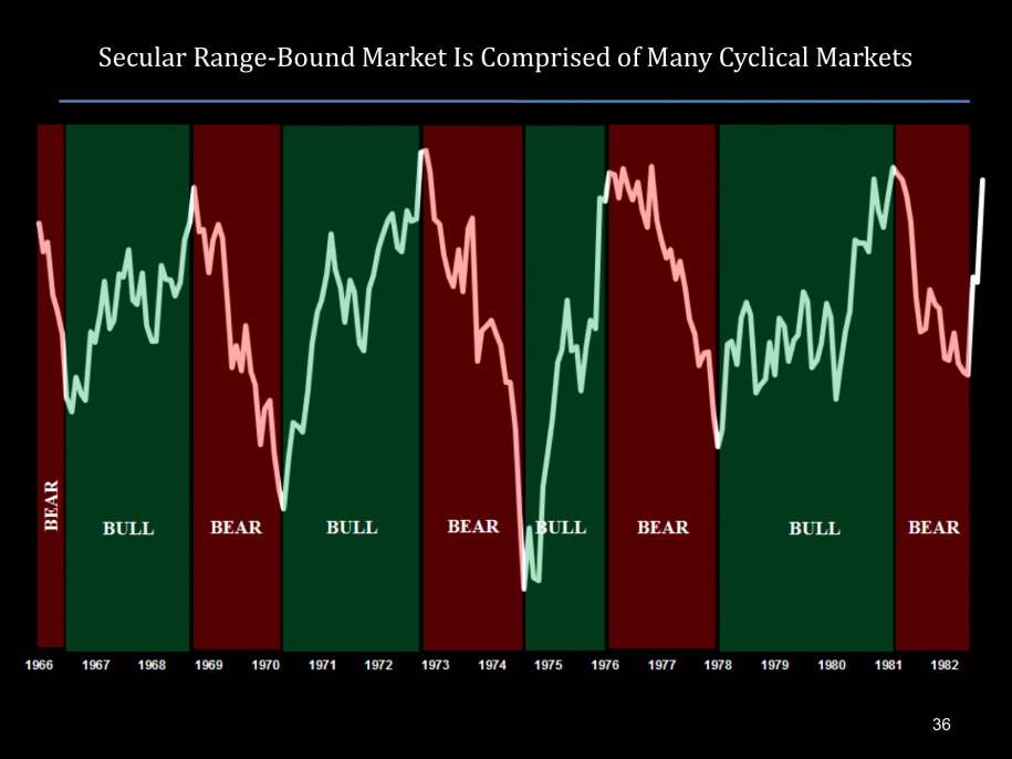 During a sideways market, asset allocation is not as important as stock selection.