Feeds:
Posts
Comments

Archive for the ‘About’ Category

The CFAInstitute blog Inside Investing has a great post on the returns to negative enterprise value stocks. Alon Bochman, CFA has investigated the performance of all negative enterprise value (“EV”) stocks trading in the United States between March 30, 1972 and September 28, 2012. He used balance sheet data from Standard & Poor’s Compustat database and merged these data with price data from the database maintained by the Center for Research in Security Prices (CRSP). He then calculated historical EVs for every company every month, as well as matching forward 12-month returns. Says Alon:

I found 2,613 stocks that at one point or another traded at a negative enterprise value between 1972 and 2012 (Microsoft, unfortunately, was not among them). The list has one entry per stock-month. That is, a stock that has traded at a negative enterprise value three months in a row will appear on the list three times. Each time is a different investment opportunity with its own forward 12-month return. The average stock spent 10.17 months (not necessarily consecutive) in negative EV territory. Thus, the list shows a total of 26,569 opportunities to invest in negative EV stocks.

The average return across all 26,569 opportunities was 50.4%. That is, if you had diligently watched the market over the last 40 years and invested $1,000 into each negative EV stock each month, your average investment would be worth $1,504 after holding that investment for one year, not including trading costs, taxes, and so on. Not bad!

Most of the opportunities are in micro caps with limited liquidity:

Returns by Market Cap -- Negative EV Investing

Alon notes that these opportunities have come up with some regularity and have usually provided attractive returns but have on occasion lost a great deal as well:

Average 12M Returns on Negative EV Stocks by Entry Year

Read Returns on Negative Enterprise Value Stocks: Money For N0thing?

Order Quantitative Value from Wiley FinanceAmazon, or Barnes and Noble.

Click here if you’d like to read more on Quantitative Value, or connect with me on LinkedIn.

Read Full Post »

Further to this post Value Badly Lagging Glamour: The Value Premium Is Now A Discount Saj Karsan requested a calculation showing the value premium using EBIT/EV:

This chart shows the average annual value premium calculated using EBIT / EV (decile 10 — decile 1) from the largest 50 percent of non-financial stocks listed in the US for the period 1999 to present.

EBIT Value PremiumThe horizontal red line is the average EBIT/EV value premium for the period at 5.4 percent. 2009 aside, the value premium has been negative since 2007 (although there is a very small premium for the incomplete 2013 year to date). Even so, the magnitude of the return in 2009 means that, in aggregate since 2007, the value premium is still slightly positive.

Order Quantitative Value from Wiley FinanceAmazon, or Barnes and Noble.

Click here if you’d like to read more on Quantitative Value, or connect with me on LinkedIn.

Read Full Post »

Two interesting charts from The Brandes Institute’s annual Value versus Glamour update for 2013. The first exhibit (2) shows the disappearance of the value premium over the last five years, and its inversion over the last two years. The yellow dotted line shows the average returns to the ten decile portfolios of stocks ranked by price-to-book value from 1968 to 2012. It demonstrates that, historically, the higher the price-to-book value, the lower the returns. The differential between the returns to the stocks in decile 10 (the “value” portfolio) and decile 1 (the “glamour” portfolio) is the value premium. That relationship seems to have broken down since 2007 (shown in blue), and inverted since 2010 (shown in red). The value premium is now a value discount!US Value Premium

The second exhibit (3) shows the rolling five-year annualized relative performance of value over glamour. In the last two rolling five-year periods, value stocks in the U.S.–marked in yellow–have delivered their worst relative performance in the 32 years of data from 1980. The Non-U.S. value stocks have continued to outperform.Rolling Five-Year Value versus GlamourAs the second exhibit demonstrates, it’s unusual for value to underperform glamour by so much and for so long. The last period of underperformance occurred in 2000, and it wasn’t as deep or prolonged. One possible explanation is that low p/b value strategies are now so well known and low p/b value stocks are so picked over that value investors have to do something special to outperform. More likely is that this is a brief period of underperformance at the tail end of a bull market and the relative performance of value over subsequent periods will compensate.

Order Quantitative Value from Wiley FinanceAmazon, or Barnes and Noble.

Click here if you’d like to read more on Quantitative Value, or connect with me on LinkedIn.

Read Full Post »

Here’s the updated St Louis Fed’s FRED on Warren Buffett’s favored market measure, total market capitalization-to-GNP:

FRED Graph

The Q1 2013 ratio – the most recent point – is 110 percent.

According to the FRED data, the Q1 2000 TTM/GNP peak ratio was 158 percent, and the Q3 2007 TTM/GNP peak was 114 percent. The average for the full period – Q3 1949 to Q3 2012 – is 69 percent. The last time the market traded at a below-average ratio was Q1 2009.

Here’s the log version:

FRED Graph

Order Quantitative Value from Wiley FinanceAmazon, or Barnes and Noble.

Click here if you’d like to read more on Quantitative Value, or connect with me on LinkedIn.

Read Full Post »

In Is the AAII Sentiment Survey a Contrarian Indicator? Charles Rotblut, CFA asks if the AAII Sentiment Survey results signal future market direction.

Each week from Thursday 12:01 a.m. until Wednesday at 11:59 p.m. the AAII asks its members a simple question:

Do you feel the direction of the stock market over the next six months will be up (bullish), no change (neutral) or down (bearish)?

AAII members participate by visiting the Sentiment Survey page (www.aaii.com/sentimentsurvey) on AAII.com and voting.

Bullish sentiment has averaged 38.8% over the life of the survey. Neutral sentiment has averaged 30.5% and bearish sentiment has averaged 30.6% over the life of the survey.

In order to determine whether there is a correlation between the AAII Sentiment Survey and the direction of the market, Rotblut looked at instances when bullish sentiment or bearish sentiment was one or more standard deviations away from the average. He then calculated the performance of the S&P 500 for the following 26-week (six-month) and 52-week (12-month) periods. The data for conducting this analysis is available on the Sentiment Survey spreadsheet, which not only lists the survey’s results, but also tracks weekly price data for the S&P 500 index.

Table 2 from the article has the results:

Table 2. Performance of Sentiment Survey as a Contrarian Indicator

Sentiment Level Number of
Observations
Average
S&P 500
Change
(%)
Median
S&P 500
Change
(%)
% of
Periods
Correctly
Contrarian
(%)
6-Month Performance
Bullish > +3 S.D. From Mean
2.0
7.4
7.4
0.0
Bullish > +2 S.D. From Mean
44.0
-0.7
0.3
48.0
Bullish > +1 S.D. From Mean
167.0
0.8
2.9
34.0
Bullish < –1 S.D. From Mean
212.0
6.9
6.2
80.0
Bullish < –2 S.D. From Mean
16.0
14.0
17.7
100.0
Bearish > +3 S.D. From Mean
3.0
25.8
23.0
100.0
Bearish > +2 S.D. From Mean
50.0
2.8
5.3
60.0
Bearish > +1 S.D. From Mean
162.0
4.7
6.0
71.0
Bearish < –1 S.D. From Mean
211.0
3.8
4.5
26.0
Bearish < –2 S.D. From Mean
9.0
-5.5
-1.7
67.0
All
1,319.0
4.0
4.7
12-Month Performance
Bullish > +3 S.D. From Mean
2.0
3.6
3.6
50.0
Bullish > +2 S.D. From Mean
44.0
-2.0
3.6
48.0
Bullish > +1 S.D. From Mean
167.0
2.4
6.3
31.0
Bullish < –1 S.D. From Mean
206.0
12.9
14.3
84.0
Bullish < –2 S.D. From Mean
16.0
20.7
21.7
100.0
Bearish > +3 S.D. From Mean
3.0
35.0
25.6
100.0
Bearish > +2 S.D. From Mean
50.0
3.1
14.3
60.0
Bearish > +1 S.D. From Mean
152.0
7.1
11.8
74.0
Bearish < –1 S.D. From Mean
211.0
7.7
9.9
24.0
Bearish < –2 S.D. From Mean
9.0
-4.3
4.8
44.0
All
1,293.0
8.4
10.2
Based on data from July 24, 1987, to May 2, 2013. Numbers are rounded.

Rotblut observes:

Neither unusual nor extraordinarily high levels of optimism are highly correlated with declining stock prices when the entire survey’s history is considered. The 44 periods with bullish sentiment readings more than two standard deviations above average were followed by a six-month fall in the S&P 500 only 48% of the time. The average six-month decline was 0.7%.

Extraordinarily high levels of pessimism have a mixed record of being correlated with higher stock prices. On a six-month basis, the S&P 500 rose 60% of the time following a bearish sentiment reading more than two standard deviations above the historical mean. The average and median gains were 2.8% and 5.3%, respectively. On a 12-month basis, the S&P 500 rose 60% of the time, with an average gain of 3.1% and a median gain of 14.3%. The average increases in prices are well below the typical increases realized throughout the entire history of the survey, though the median increases are greater than the typical gains.

Read Is the AAII Sentiment Survey a Contrarian Indicator?

Order Quantitative Value from Wiley FinanceAmazon, or Barnes and Noble.

Click here if you’d like to read more on Quantitative Value, or connect with me on LinkedIn.

Read Full Post »

Margin debt in the United States — money borrowed against securities in brokerage accounts — has risen to its highest level ever, at $384 billion, surpassing the previous peak of $381 billion set in July 2007 according to New York Times Business Day’s Off The Charts: Sign of Excess?. Margin debt as a proportion of GDP is not quite yet at the peak set in 2007, but it has exceeded 2.25% only twice previously in the last 50 years–2000 and 2007. The bottom panel shows that each of those instances was followed by a large drawdown:

NYT Margin Debt

Read Off The Charts: Sign of Excess?

Order Quantitative Value from Wiley FinanceAmazon, or Barnes and Noble.

Click here if you’d like to read more on Quantitative Value, or connect with me on LinkedIn.

h/t SD.

Read Full Post »

Butler|Philbrick|Gordillo & Associates is out with a great new post “Triumph of the Ostriches” discussing the market’s current level of overvaluation. Here is the summary of Butler|Philbrick|Gordillo’s forecasts:

Table 1. Statistical Return Forecasts for U.S. Stocks Over Relevant Investment Horizons

Source: Shiller (2013), DShort.com (2013), Chris Turner (2013), World Exchange Forum (2013), Federal Reserve (2013), Butler|Philbrick|Gordillo & Associates (2013)

Butler|Philbrick|Gordillo comment:

We have yet to see any evidence-based argument for why the valuation based analysis presented above is not relevant. What do we mean by ‘evidence based’? Show us numbers to support an alternative hypothesis, and then show me how those numbers have served to forecast returns in other periods with statistical significance.

Other memes relate to the idea of a ‘permanently high plateau’ (incidentally, the great 20th century economist Irving Fisher coined that phrase in 1929, just three days before the crash that preceded the Great Depression). Purveyors of this delusion cite the current ‘pollyanna’ environment for global corporations as validation for stratospheric equity valuations. “Corporations have high record cash positions”, they crow, “get ready for the great buy back and merger wave that’s coming!” “Profit margins are high, corporate taxes are near all-time lows, wage pressures are non-existent – corporations have never had it better! Oh and financing is effectively free!”

Unfortunately the wailing equity zealots do not factor in Stein’s Law, which states, “If something cannot go on forever, it will stop.” In a period of record fiscal duress, what is the probability that corporations will continue to receive favourable tax status? According to GMO’s analysis, corporate profit margins are one of the most mean-reverting series in finance, so why would be value markets under the assumption that they will stay high forever? Further, how valuable is the cash on corporate balance sheets if there is an equally large debt balance on the other side of the ledger (there is)?

The Ostriches aren’t concerned with valuation metrics or Stein’s Law, and let’s face it, they’ve been right to stick their head in the sand – at least so far. The problem is that in markets we won’t know who is right until the bottom of the final cyclical bear in this ongoing secular bear market. Only then will we see just how far from fundamentals the authorities have managed to push prices, and only then will we see whether it really is different this time.

Until then, investors can choose facts or faith. The facts say that investors are unlikely to be compensated at current valuations for the risks of owning stocks over the next few years. The church of equities says, ‘don’t worry about it’. So far the Ostriches have it, but all meaningful evidence suggests that over the next few years the Ostriches are going to feel like turkeys – at Thanksgiving.

Read Triumph of the Ostriches.

Order Quantitative Value from Wiley FinanceAmazon, or Barnes and Noble.

Click here if you’d like to read more on Quantitative Value, or connect with me on LinkedIn.

Read Full Post »

Warren Buffett’s favored market valuation metric, market capitalization-to-gross national product, has passed an unwelcome milestone: the 2007 valuation peak, according to GuruFocus:

TMTGNP 2007

The index topped out at 110.7 percent in 2007, and presently stands at 111.7 percent. From GuruFocus:

As of today, the Total Market Index is at $ 17624.4 billion, which is about 111.7% of the last reported GDP. The US stock market is positioned for an average annualized return of 2.2%, estimated from the historical valuations of the stock market. This includes the returns from the dividends, currently yielding at 2%.

I’ve seen several arguments for why this time is different, and why it’s not a bubble. I don’t buy it. When we see clear skies, that’s all we can imagine, and so we extrapolate it over the horizon. From Seth Klarman’s latest:

Investing, when it looks the easiest, is at its hardest. When just about everyone heavily invested is doing well, it is hard for others to resist jumping in. But a market relentlessly rising in the face of challenging fundamentals–recession in Europe and Japan, slowdown in China, fiscal stalemate and high unemployment in the U.S.– is the riskiest environment of all.

[O]nly a small number of investors maintain the fortitude and client confidence to pursue long-term investment success even at the price of short-term underperformance. Most investors feel the hefty weight of short-term performance expectations, forcing them to take up marginal or highly speculative investments that we shun. When markets are rising, such investments may perform well, which means that our unwavering patience and discipline sometimes impairs our results and makes us appear overly cautious. The payoff from a risk-averse, long-term orientation is–just that–long term. It is measurable only over the span of many years, over one or more market cycles.

Our willingness to invest amidst failing markets is the best way we know to build positions at great prices, but this strategy, too, can cause short-term underperformance. Buying as prices are falling can look stupid until sellers are exhausted and buyers who held back cannot effectively deploy capital except at much higher prices. Our resolve in holding cash balances–sometimes very large ones–absent compelling opportunity is another potential performance drag.

For more on market value-to-GNP see my earlier posts Warren Buffett Talks… Total Market Value-To-Gross National ProductWarren Buffett and John Hussman On The Stock MarketFRED on Buffett’s favored market measure: Total Market Value-to-GNPThe Physics Of Investing In Expensive Markets: How to Apply Simple Statistical Models.

Order Quantitative Value from Wiley FinanceAmazon, or Barnes and Noble.

Click here if you’d like to read more on Quantitative Value, or connect with me on LinkedIn.

Read Full Post »

In a great article The Wiki Man: If you want to diet, I’m afraid you really do need one weird rule Rory Sutherland argues that we require a “black-and-white, binary approach” to things we find psychologically difficult to follow. Sutherland says, “And as the world’s religions have known for thousands of years, abstinence is far easier than the continuous exercise of self-restraint. Or, as the neuroscientist V.S. Ramachandran suggests, “humans may not have free will but they do have free won’t.”

Absolute rules (if X, then Y) work with the grain of human nature. We feel far more guilt running a red light than breaking a speed limit. Notice that almost all religious laws are absolute: no food is half kosher; it is or it isn’t. No Old Testament prophet proposed something as daft as the French 35-hour ‘working-time directive’: they invented the Sabbath instead.

In a more complex world weighed down by Big Data, convoluted tax structures and impenetrable legislation, do we actually need more of what religion once gave us: simple, unambiguous, universal absolutes? In law such rules are known as Bright Line Rules: rather than 20 million words of tax law, you simply declare ‘any financial transaction whose only conceivable motivation is the avoidance of tax is by definition illegal’.

Does a complex world need simpler rules? And simpler metrics? The temptation is that because we have gigabytes of data, we feel the need to use all of it. Perhaps all you need is a few bits of the right information?

During the second world war, experts needed to decide whom to train as RAF fighter pilots. Today this would mean a battery of complex tests. Back then they used two simple questions: 1) Have you ever owned a motorcycle? 2) Do you own one now? The ideal recruits were those who answered 1) Yes and 2) No. They wanted people who had been brave enough to ride a motorbike but were sane enough to abandon the habit.

How many of the world’s problems could be solved if we abandoned this pretence of perfect rationality and fell back on simple, heuristic rules of thumb? According to the brilliant German decision-scientist Gerd Gigerenzer, quite a few.

The investing corollaries are easy to find. I’ll expand on that later this week.

Order Quantitative Value from Wiley FinanceAmazon, or Barnes and Noble.

Click here if you’d like to read more on Quantitative Value, or connect with me on LinkedIn.

h/t @abnormalreturns and @farnamstreet

Read Full Post »

David Tepper was on CNBC this morning arguing that stocks are historically cheap:

[Tepper] said the post showed “when the equity risk premium is high historically, you get better returns after that.” He continued, “So we’re at one of the highest all-time risk premiums in history.”

In making his argument Tepper referred to this article, Are Stocks Cheap? A Review of the Evidence, in which Fernando Duarte and Carlo Rosa argue that stocks are cheap because the “Fed model”—the equity risk premium measured as the difference between the forward operating earnings yield on the S&P500 and the 10-year Treasury bond yield—is at a historic high. Here’s the chart:

Here’s Duarte and Rosa in the article:

Let’s now take a look at the facts. The chart [above] shows the weighted average of the twenty-nine models for the one-month-ahead equity risk premium, with the weights selected so that this single measure explains as much of the variability across models as possible (for the geeks: it is the first principal component). The value of 5.4 percent for December 2012 is about as high as it’s ever been.The previous two peaks correspond to November 1974 and January 2009. Those were dicey times. By the end of 1974, we had just experienced the collapse of the Bretton Woods system and had a terrible case of stagflation. January 2009 is fresher in our memory. Following the collapse of Lehman Brothers and the upheaval in financial markets, the economy had just shed almost 600,000 jobs in one month and was in its deepest recession since the 1930s. It is difficult to argue that we’re living in rosy times, but we are surely in better shape now than then.

The Fed model seems like an intuitive measure of market valuation, but how predictive has it been historically? John Hussman examined it in his August 20, 2007 piece Long-Term Evidence on the Fed Model and Forward Operating P/E Ratios. Hussman writes:

The assumed one-to-one correspondence between forward earnings yields and 10-year Treasury yields is a statistical artifact of the period from 1982 to the late 1990’s, during which U.S. stocks moved from profound undervaluation (high earnings yields) to extreme overvaluation (depressed earnings yields). The Fed Model implicitly assumes that stocks experienced only a small change in “fair valuation” during this period (despite the fact that stocks achieved average annual returns of nearly 20% for 18 years), and attributes the change in earnings yields to a similar decline in 10-year Treasury yields over this period.

Unfortunately, there is nothing even close to a one-to-one relationship between earnings yields and interest rates in long-term historical data. Why doesn’t Wall Street know this? Because data on forward operating earnings estimates has only been compiled since the early 1980’s. There is no long-term historical data, and for this reason, the “normal” level of forward operating P/E ratios, as well as the long-term validity of the Fed Model, has remained untested.

Ruh roh. The Fed model is not predictive? What is? Hussman continues:

… [T]he profile of actual market returns – especially over 7-10 year horizons – looks much like the simple, humble, raw earnings yield, unadjusted for 10-year Treasury yields (which are too short in duration and in persistence to drive the valuation of stocks having far longer “durations”).

On close inspection, the Fed Model has nearly insane implications. For example, the model implies that stocks were not even 20% undervalued at the generational 1982 lows, when the P/E on the S&P 500 was less than 7. Stocks followed with 20% annual returns, not just for one year, not just for 10 years, but for 18 years. Interestingly, the Fed Model also identifies the market as about 20% undervalued in 1972, just before the S&P 500 fellby half. And though it’s not depicted in the above chart, if you go back even further in history, you’ll find that the Fed Model implies that stocks were about as “undervalued” as it says stocks are today – right before the 1929 crash.

Yes, the low stock yields in 1987 and 2000 were unfavorable, but they were unfavorable without the misguided one-for-one “correction” for 10-year Treasury yields that is inherent in the Fed Model. It cannot be stressed enough that the Fed Model destroys the information that earnings yields provide about subsequent market returns.

The chart below presents the two versions of Hussman’s calculation of the equity risk premium along with the annual total return of the S&P 500 over the following decade.

Source: Hussman, Investment, Speculation, Valuation, and Tinker Bell (March 2013)

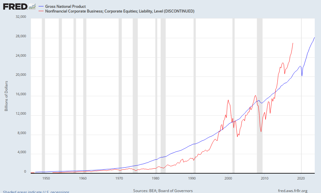
That’s not a great fit. The relationship is much less predictive than the other models I’ve considered on Greenbackd over the last month or so (see, for example, the Shiller PE, Buffett’s total market capitalization-to-gross national product, and the equity q ratio, all three examined together in The Physics Of Investing In Expensive Markets: How to Apply Simple Statistical Models). Hussman says in relation to the chart above:

… [T]he correlation of “Fed Model” valuations with actual subsequent 10-year S&P 500 total returns is only 47% in the post-war period, compared with 84% for the other models presented above [Shiller PE with mean reversion, dividend model with mean reversion, market capitalization-to-GDP]. In case one wishes to discard the record before 1980 from the analysis, it’s worth noting that since 1980, the correlation of the FedModel with subsequent S&P 500 total returns has been just 27%, compared with an average correlation of 90% for the other models since 1980. Ditto, by the way for the relationship of these models with the difference between realized S&P 500 total returns and realized 10-year Treasury returns.

Still, maybe the Fed Model is better at explaining shorter-term market returns. Maybe, but no. It turns out that the correlation of the Fed Model with subsequent one-year S&P 500 total returns is only 23% –  regardless of whether one looks at the period since 1948 (which requires imputed forward earnings since 1980), or the period since 1980 itself. All of the other models have better records. Two-year returns? Nope. 20% correlation for the Fed Model, versus an average correlation of 50% for the others.

Are stocks cheap on the basis of the Fed model? It seems so. Should we care? No. I’ll leave the final word to Hussman:

Over time, Fed Model adherents are likely to observe behavior in this indicator that is much more like its behavior prior to the 1980’s. Specifically, the Fed model will most probably creep to higher and higher levels of putative “undervaluation,” which will be completely uninformative and uncorrelated with actual subsequent returns.

The popularity of the Fed Model will end in tears. The Fed Model destroys useful information. It is a statistical artifact. It is bait for investors ignorant of history. It is a hook; a trap.

Hussman wrote that in August 2007 and he was dead right. He still is.

Order Quantitative Value from Wiley FinanceAmazon, or Barnes and Noble.

Click here if you’d like to read more on Quantitative Value, or connect with me on LinkedIn.

Read Full Post »

« Newer Posts - Older Posts »